Submitted over 4 years agoA solution to the Four card feature section challenge
Four card feature section using HTML and CSS
LVL 4

@byronbyron
Solution retrospective
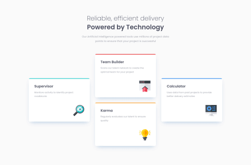
Hello ladies and gentlemen! This was a nice little fun one. I used flexbox with some transforms to get the layout right on desktop. I also added some bonus hover states as well. Please leave a like and maybe even a cheeky comment!
Code
Loading...
Please log in to post a comment
Log in with GitHubCommunity feedback
No feedback yet. Be the first to give feedback on Byron’s solution.
Join our Discord community
Join thousands of Frontend Mentor community members taking the challenges, sharing resources, helping each other, and chatting about all things front-end!
Join our Discord