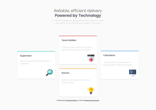
Four Card Features Section

Solution retrospective
I am really proud of the fact that I completed this project on my own using Tailwind CSS. This is the first project I have used it in (outside of tutorial videos). There were a few times that I got stuck and wanted to just go back to regular CSS, but I kept pushing through.
I do want to go back and clean up some of the classes a bit. I have several sections where I reused the CSS. I am thinking that I can make custom classes to apply so the HTML looks cleaner.
What challenges did you encounter, and how did you overcome them?I had a hard time getting some of the layouts to shift correctly in my css. Since I was using tailwind for the first time on my own, I had to find which the specific items that I needed to change to get my layouts to work. It was a different experience for me than using plain CSS like I have in past projects.
I used a Tailwind Cheat sheet for quick reference on my class names to try to help me complete this challenge faster. You can find it here (https://tailwindcomponents.com/cheatsheet)
What specific areas of your project would you like help with?I had a hard time getting the first and last card in the right positions. I used position absolute to move them but I was having a hard time getting my Tailwind classes to fully cooperate to adjust the spacing the way I wanted. I'd love to know if there's a better/easier way to do that part than the way I did it.
Please log in to post a comment
Log in with GitHubCommunity feedback
No feedback yet. Be the first to give feedback on Stephanie Dennehy’s solution.
Join our Discord community
Join thousands of Frontend Mentor community members taking the challenges, sharing resources, helping each other, and chatting about all things front-end!
Join our Discord