frontend-mentor-intropage made with bootstrap

Solution retrospective
My process
prerequisites
- Looked at the design files and getting and overall understanding of the project.
- Installed bootstrap using npm package manager.
- Imported the project assets and other relevant components and files.
- Linked all relevant files to the 'index.html' file.
build-process
-
I divided the task/project into two sections,
- The Navigation section
- The Hero section
-
The Navigation section: I wrote out the custom code for bootstrap 'brand-name' for the Logo and the 'toggle-button', for the mobile navigation toggler. Due to the fact that it was a side-navbar I had to wrap the navigation menu in a container with the bootstrap off-canvas class and set to end so it slides from the left.
<div
  class="offcanvas offcanvas-end"
  tabindex="-1"
  id="offcanvasNavbar"
  aria-labelledby="offcanvasNavbarLabel"
>
  <!-- sidenav header -->
  <div class="offcanvas-header justify-content-end">
    <button
      type="button"
      class="btn-close text-reset shadow-none"
      data-bs-dismiss="offcanvas"
      aria-label="Close"
    ></button>
  </div>
  <!-- sidenav body  -->
  <div class="offcanvas-body">
    <ul class="navbar-nav justify-content-start flex-grow-1 ms-4">
      <!-- nav dropdown item 1 -->
      <li class="nav-item px-2 dropdown">
        <a class="nav-link dropdown-toggle" data-bs-toggle="dropdown" href="#"
          >Features</a
        >
        <!-- dropdown menu -->
        <ul class="dropdown-menu border-0 bg-white">
          <li class="dropdown-item d-flex align-items-center">
            <div class="todo-icon icon"></div>
            <a href="#" class="nav-link">Todo List</a>
          </li>
          <li class="dropdown-item d-flex align-items-center">
            <div class="calender-icon icon"></div>
            <a href="#" class="nav-link">Calender</a>
          </li>
          <li class="dropdown-item d-flex align-items-center">
            <div class="reminder-icon icon"></div>
            <a href="#" class="nav-link">Reminders</a>
          </li>
          <li class="dropdown-item d-flex align-items-center">
            <div class="planning-icon icon"></div>
            <a href="#" class="nav-link">Reminders</a>
          </li>
        </ul>
      </li>
      <!--nav dropdown item 2  -->
      <li class="nav-item px-2 dropdown">
        <a class="nav-link dropdown-toggle" href="#" data-bs-toggle="dropdown"
          >Company</a
        >
        <!-- dropdown menu -->
        <ul class="dropdown-menu border-0 bg-white">
          <li class="dropdown-item">
            <a href="#" class="nav-link">History</a>
          </li>
          <li class="dropdown-item">
            <a href="#" class="nav-link">Our Team</a>
          </li>
          <li class="dropdown-item">
            <a href="#" class="nav-link">Blog</a>
          </li>
        </ul>
      </li>

      <li class="nav-item px-2">
        <a class="nav-link" href="#">Careers</a>
      </li>
      <li class="nav-item px-2">
        <a class="nav-link" href="#">About</a>
      </li>
    </ul>

    <div class="navbar-nav align-items-center mt-3 mt-lg-0">
      <li class="me-4"><a href="#" class="nav-link">Login</a></li>
      <li>
        <a href="#" class="nav-link py-2 px-lg-4  px-5 register">Register</a>
      </li>
    </div>
  </div>
</div>
Added the body of the side nav and made some minor adjustments to the layout to make it as similar to the design as possible.
The navigation menu contained dropdown- menus with I implemented using bootstrap custom dropdown menu, made slight adjustments to the design to ensure it looked close to the design.
-
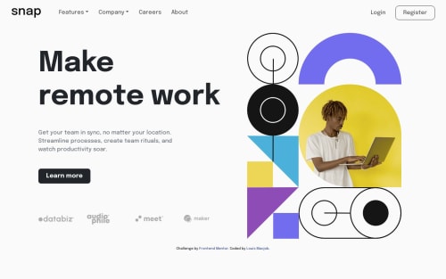
The Hero section: due to the fact that the mobile and desktop view of the hero section were different (pertaining to the position of some elements), I had to create two separate hero sections to accommodate for the differences,
-
The desktop hero version: Was made wth basic grid layout, and the text container what made with flex.
-
The mobile section was made with flex.
<section class="row p-lg-3 mobile-hero"> <!-- mobile hero img --> <section class="hero-img col-lg-6"> <img src="./images/image-hero-mobile.png" class="w-100" alt="" /> </section> <!-- mobile hero text --> <section class="hero-text text-center col-lg-6 mt-5"> <h1 class="display-5">Make remote work</h1> <p class="text my-4"> Get your team in sync, no matter your location. Streamline processes, create team rituals, and watch productivity soar. </p> <button class="btn btn-dark py-2 px-4 mb-4 rounded-3 learn-more">Learn more</button> <div class="row mt-5 justify-content-center align-items-center"> <div class="col-3 client"><img src="./images/client-databiz.svg" alt="databiz image"></div> <div class="col-3 client"><img src="./images/client-audiophile.svg" alt="audiophile image"></div> <div class="col-3 client"><img src="./images/client-meet.svg" alt="meet image"></div> <div class="col-3 client"><img src="./images/client-maker.svg" alt="maker image"></div> </div> </section> </section> <!-- desktop hero display --> <section class="row p-3 desktop-hero"> <section class="hero-text col-lg-6 align-self-center me-5"> <h1 class="display-1">Make remote work</h1> <p class="text-secondary my-5 w-75"> Get your team in sync, no matter your location. Streamline processes, create team rituals, and watch productivity soar. </p> <button class="btn btn-dark learn-more py-2 px-4 mb-5 rounded-3">Learn more</button> <div class="row mt-5 justify-content-center align-items-center"> <div class="col-3 client"><img src="./images/client-databiz.svg" alt="databiz image"></div> <div class="col-3 client"><img src="./images/client-audiophile.svg" alt="audiophile image"></div> <div class="col-3 client"><img src="./images/client-meet.svg" alt="meet image"></div> <div class="col-3 client client-maker"><img src="./images/client-maker.svg" alt="maker image"></div> </div> </section> <section class="hero-img col-lg-5"> <img src="./images/image-hero-desktop.png" class="w-100" alt="" /> </section> </section> -
- Semantic HTML5 markup
- CSS custom properties
- Flexbox
- CSS Grid
- Mobile-first workflow
- Bootstrap - CSS framework
Please log in to post a comment
Log in with GitHubCommunity feedback
No feedback yet. Be the first to give feedback on Louis’s solution.
Join our Discord community
Join thousands of Frontend Mentor community members taking the challenges, sharing resources, helping each other, and chatting about all things front-end!
Join our Discord