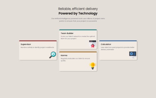
Submitted over 1 year agoA solution to the Four card feature section challenge
HTML CSS Grid Flex variables, absolute positioning
LVL 4

@35degrees
Solution retrospective
What are you most proud of, and what would you do differently next time?
I'm proud that I used both flex and grid, got the border color and height just right, and used absolute positioning for the image icons.
What challenges did you encounter, and how did you overcome them?in the smaller width media query, it took me a minute to realize I have to 'reset' the grid-template-rows or the grid tries to force itself into the bigger pattern even at one column.
Code
Loading...
Please log in to post a comment
Log in with GitHubCommunity feedback
No feedback yet. Be the first to give feedback on Sam Hooker’s solution.
Join our Discord community
Join thousands of Frontend Mentor community members taking the challenges, sharing resources, helping each other, and chatting about all things front-end!
Join our Discord