Skip to content
  • Unlock Pro
  • Log in with GitHub
Solution
Submitted about 5 years ago

Mobile(375px) & Desktop(1440px) Four Card Feature with Sass & CSS Grid

Elena Stagg•220
@elenastagg
A solution to the Four card feature section challenge
View live sitePreview (opens in new tab)View codeCode (opens in new tab)

Solution retrospective


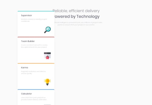
Please view the solution via the link rather than the screenshot, it has been updated since. I used the pixelperfect plug-in to match the design to the 1440px image given, rather than the general desktop/mobile sizes given on chrome.

Took me ages faffing around with spacing for the desktop version - any tips on writing clear concise media queries would be great, or are you meant to write a whole new set of rules as I have done?!

Code
Loading...

Please log in to post a comment

Log in with GitHub

Community feedback

No feedback yet. Be the first to give feedback on Elena Stagg's solution.

Join our Discord community

Join thousands of Frontend Mentor community members taking the challenges, sharing resources, helping each other, and chatting about all things front-end!

Join our Discord
Frontend Mentor logo

Stay up to datewith new challenges, featured solutions, selected articles, and our latest news

Frontend Mentor

  • Unlock Pro
  • Contact us
  • FAQs
  • Become a partner

Explore

  • Learning paths
  • Challenges
  • Solutions
  • Articles

Community

  • Discord
  • Guidelines

For companies

  • Hire developers
  • Train developers
© Frontend Mentor 2019 - 2025
  • Terms
  • Cookie Policy
  • Privacy Policy
  • License

Oops! 😬

You need to be logged in before you can do that.

Log in with GitHub

Oops! 😬

You need to be logged in before you can do that.

Log in with GitHub

How does the accessibility report work?

When a solution is submitted, we use axe-core to run an automated audit of your code.

This picks out common accessibility issues like not using semantic HTML and not having proper heading hierarchies, among others.

This automated audit is fairly surface level, so we encourage to you review the project and code in more detail with accessibility best practices in mind.

How does the CSS report work?

When a solution is submitted, we use stylelint to run an automated check on the CSS code.

We've added some of our own linting rules based on recommended best practices. These rules are prefixed with frontend-mentor/ which you'll see at the top of each issue in the report.

The report will audit 1st-party linked stylesheets, and styles within <style> tags.

How does the HTML validation report work?

When a solution is submitted, we use html-validate to run an automated check on the HTML code.

The report picks out common HTML issues such as not using headings within section elements and incorrect nesting of elements, among others.

Note that the report can pick up “invalid” attributes, which some frameworks automatically add to the HTML. These attributes are crucial for how the frameworks function, although they’re technically not valid HTML. As such, some projects can show up with many HTML validation errors, which are benign and are a necessary part of the framework.