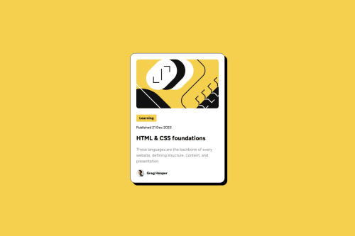
Responsive blog card using flexbox and CSS clamp() property

Solution retrospective
First time using this css property. The challenge asked for a responsive font-size without using media queries. Found this property to be the most suitable after doing some research. Still trying to understand how it works.
I am going to work more on responsiveness with media queries and properties like clamp.
I will also dive a bit more into Figma to understand how to better use it and get the most out of the figma files.
What challenges did you encounter, and how did you overcome them?I struggled first with what was asked concerning font-size responsiveness. I did some research and found an article about the CSS clamp() property.
What specific areas of your project would you like help with?The main aspect that could be of a problem is the beginning of a project. Should I use semantic html? Should I wrap every element into div containers?
Please log in to post a comment
Log in with GitHubCommunity feedback
No feedback yet. Be the first to give feedback on Arnaud Lahaut’s solution.
Join our Discord community
Join thousands of Frontend Mentor community members taking the challenges, sharing resources, helping each other, and chatting about all things front-end!
Join our Discord