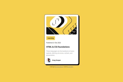
Submitted almost 2 years agoA solution to the Blog preview card challenge
responsive card layout
pure-css
LVL 2

@Uzmakh
Solution retrospective
What are you most proud of, and what would you do differently next time?
Though the project was simple and basic in html structure and css styling, I enjoyed it, recalling my basic learning of html and css. I recalled: how to make card responsive, how ihe inner elements image, divs, hi, p etc are positioned properly in accordance with responsiveness. I used flexbox in the project.
What challenges did you encounter, and how did you overcome them?The project was simple enough and I didn't face any difficulty.
What specific areas of your project would you like help with?I want to have feedback on whether I put the right code of max-width for the 2 screen sizes?
Code
Loading...
Please log in to post a comment
Log in with GitHubCommunity feedback
No feedback yet. Be the first to give feedback on Uzma Khan’s solution.
Join our Discord community
Join thousands of Frontend Mentor community members taking the challenges, sharing resources, helping each other, and chatting about all things front-end!
Join our Discord