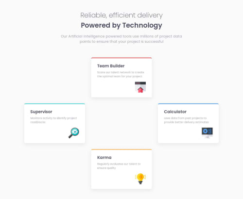
Submitted over 2 years agoA solution to the Four card feature section challenge
Responsive Four card feature section made with Tailwind CSS and React
react, tailwind-css
LVL 2

@Mut1s0
Solution retrospective
I'm having some trouble while doing the projects especially when it comes to making the page responsive on Tablet screens and bigger especially when it comes to adjusting the height to fit the screens when needed, can someone please assists me with this issue.
Any other feedback is welcome as well.
Code
Loading...
Please log in to post a comment
Log in with GitHubCommunity feedback
No feedback yet. Be the first to give feedback on Allan’s solution.
Join our Discord community
Join thousands of Frontend Mentor community members taking the challenges, sharing resources, helping each other, and chatting about all things front-end!
Join our Discord