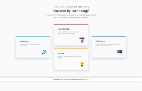
Responsive Four-Card Layout Using CSS Grid & Flexbox

Solution retrospective
I’m proud of how I implemented a clean, responsive layout using CSS Grid and Flexbox. The design looks visually appealing and maintains good structure across different screen sizes. Next time, I would explore adding subtle animations or hover effects to enhance user interaction and make the cards feel more dynamic.
What challenges did you encounter, and how did you overcome them?One challenge was ensuring proper spacing and alignment, especially in the mobile view. Initially, the cards were misaligned due to inconsistent padding and width settings. I resolved this by adjusting the container widths and ensuring box-sizing: border-box was applied universally. Additionally, tweaking media queries helped achieve a balanced layout across devices.
What specific areas of your project would you like help with?I’d appreciate feedback on improving responsiveness further, especially for tablet screens where the layout feels a bit stretched. Also, are there any best practices for optimizing the CSS structure to make it more maintainable and scalable? Any suggestions for improving accessibility would also be helpful! 🚀
Please log in to post a comment
Log in with GitHubCommunity feedback
No feedback yet. Be the first to give feedback on Ranjitkumar Ravindran's solution.
Join our Discord community
Join thousands of Frontend Mentor community members taking the challenges, sharing resources, helping each other, and chatting about all things front-end!
Join our Discord