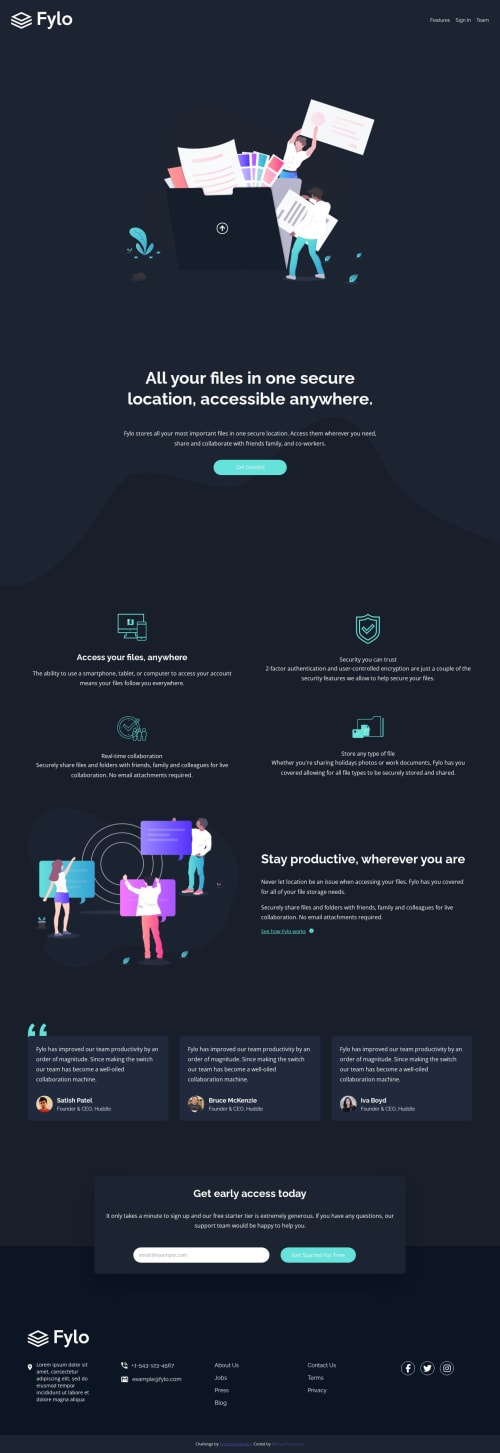
Responsive landing page using CSS Grid and Tailwind CSS

Solution retrospective
I'm most proud of how I implemented the responsive design using CSS Grid and Tailwind CSS. This approach allowed me to create a flexible layout that adapts seamlessly to different screen sizes. Next time, I would focus on optimizing the images and code further to improve the site's load time and performance.
What challenges did you encounter, and how did you overcome them?One of the main challenges was ensuring cross-browser compatibility and making sure the design looked consistent across different devices. I overcame this by using modern CSS techniques and thoroughly testing the site on various browsers and devices. Additionally, setting up Webpack for the first time was a bit tricky, but following documentation and tutorials helped streamline the process.
What specific areas of your project would you like help with?I would like feedback on my use of Webpack, particularly regarding best practices for configuration and optimization. Additionally, any suggestions for improving the accessibility of the site would be highly appreciated.
Please log in to post a comment
Log in with GitHubCommunity feedback
No feedback yet. Be the first to give feedback on Manuel francisco’s solution.
Join our Discord community
Join thousands of Frontend Mentor community members taking the challenges, sharing resources, helping each other, and chatting about all things front-end!
Join our Discord