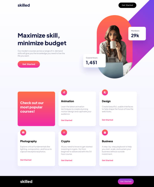
Responsive Landing Page with a Tricky Offset Hero Image

Solution retrospective
-
Anyone know what would be the best practice for achieving that image that sticks to the top-right of the design and is offset? I accomplished it with background-image positioning on a container div, but I feel like it's probably not the best practice.
-
The challenge provides a Design where the desktop version is a fixed-width (or at least seems like it due to the offset hero image), so I created it with a container and inner-container that are fixed width (1440 and 1100 as per Figma). But it feels weird to have a static page that doesn't grow and shrink or adapt to the monitor size. Doesn't feel like a "best practice", and it looks odd when the screen is just a bit wider than the container (say 1500px), which leaves an akward gap on the sides of the screen. Is this the best we can do if a designer provides us this kind of a design, or is there a better way?
Please log in to post a comment
Log in with GitHubCommunity feedback
No feedback yet. Be the first to give feedback on Alek’s solution.
Join our Discord community
Join thousands of Frontend Mentor community members taking the challenges, sharing resources, helping each other, and chatting about all things front-end!
Join our Discord