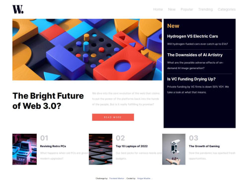
Submitted about 2 years agoA solution to the News homepage challenge
Responsive New Page CSS Grid and Flexbox
LVL 3
@Holgermueller

Solution retrospective
What are you most proud of, and what would you do differently next time?
I'm proud of being able to finish this and have it looking at least halfway decent. Though, I'm a little frustrated I can't figure out the close icon for the mobile nav. I've tried text-align: right; and margin-left:auto; but neither did anything.
What challenges did you encounter, and how did you overcome them?I had a heck of a time figuring out the mobile nav overlay. I found something similar on W3 school and was able to reverse engineer what I saw there to complete the nav here.
What specific areas of your project would you like help with?If anyone has a good solution for the mobile nav close icon positioning, I'm all ears!
Code
Loading...
Please log in to post a comment
Log in with GitHubCommunity feedback
No feedback yet. Be the first to give feedback on Holger Mueller’s solution.
Join our Discord community
Join thousands of Frontend Mentor community members taking the challenges, sharing resources, helping each other, and chatting about all things front-end!
Join our Discord