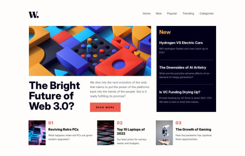
Responsive news homepage with SCSS, Flexbox, Grid and Js

Solution retrospective
I'm most proud of how I structured the layout using a combination of Flexbox and CSS Grid, and how I organized the SCSS for clean scalability. I also handled the JavaScript toggle menu for mobile navigation, which worked smoothly. Next time, I would optimize the layout behavior further at tablet breakpoints and explore animation libraries to enhance interactivity.
What challenges did you encounter, and how did you overcome them?Challenge was managing the toggle menu's visibility on small screens, which I fixed using basic JavaScript event listeners to add/remove classes dynamically.
What specific areas of your project would you like help with?Looking for feedback on:
SCSS media queries
JS toggle logic
Design polish and responsiveness
Please log in to post a comment
Log in with GitHubCommunity feedback
No feedback yet. Be the first to give feedback on Abdukadir Ibrahim’s solution.
Join our Discord community
Join thousands of Frontend Mentor community members taking the challenges, sharing resources, helping each other, and chatting about all things front-end!
Join our Discord