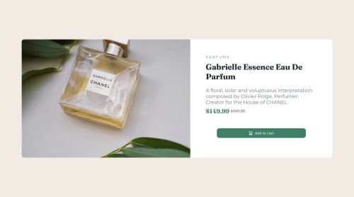
Skip to content
  • Unlock Pro
  • Log in with GitHub
Solution
Submitted about 1 year ago

Responsive Product Page Using CSS, HTML, and Media Queries

Eric•70
@esurreal
A solution to the Product preview card component challenge
View live sitePreview (opens in new tab)View codeCode (opens in new tab)

Solution retrospective


What are you most proud of, and what would you do differently next time?

I'm proud of the fact that I'm learning this stuff.

What challenges did you encounter, and how did you overcome them?

Media queries took a little time to understand. Making the page responsive was the biggest learning curve.

What specific areas of your project would you like help with?

I think I need help with image sizing and keeping everything within the container, but It'll probably come with practice.

Code
Select a file

Please log in to post a comment

Log in with GitHub

Community feedback

  • Guilherme Costa•100
    @cdGuilherme
    Posted about 1 year ago

    Hi Eric, great job on submitting your solution!

    Here are my suggestions:

    Does the solution include semantic HTML?

    • Good job using the <main> element. This is good for accessibility as it helps screen readers identify a page's "main" section.

    Is it accessible, and what improvements could be made?

    • <grid> and <p3> are not valid HTML elements, instead use a div with a class for the price container and use h2 and h3 elements for the prices.
    • Font sizes must never be inpx as it prevents the font size from scaling with the user's default setting.

    Does the layout look good on a range of screen sizes?

    • The layout breaks on some screen sizes. I suggest removing fixed widths and heights, this is something you should rarely do because components should be able to adapt for different screen sizes.
    • Other than that you did a good job with flexbox for the container, it adapts well when changing from column to row on different screen sizes.

    Is the code well-structured, readable, and reusable?

    • For better reusability, you can store colors inside CSS variables using the :root pseudo-class.

    Does the solution differ considerably from the design?

    • Desktop viewing is too wide, I would suggest decreasing the container width using the max-width property.

    • As for the image sizing I suggest setting a max-width and max-height to 100% for the img element.

    • You can switch images from desktop to mobile using the <picture> element with media queries.

    Hope this can be useful! Good luck! 🙏

Join our Discord community

Join thousands of Frontend Mentor community members taking the challenges, sharing resources, helping each other, and chatting about all things front-end!

Join our Discord

Stay up to datewith new challenges, featured solutions, selected articles, and our latest news

Frontend Mentor

  • Unlock Pro
  • Contact us
  • FAQs
  • Become a partner

Explore

  • Learning paths
  • Challenges
  • Solutions
  • Articles

Community

  • Discord
  • Guidelines

For companies

  • Hire developers
  • Train developers
© Frontend Mentor 2019 - 2025
  • Terms
  • Cookie Policy
  • Privacy Policy
  • License

Oops! 😬

You need to be logged in before you can do that.

Log in with GitHub

Oops! 😬

You need to be logged in before you can do that.

Log in with GitHub

How does the accessibility report work?

When a solution is submitted, we use axe-core to run an automated audit of your code.

This picks out common accessibility issues like not using semantic HTML and not having proper heading hierarchies, among others.

This automated audit is fairly surface level, so we encourage to you review the project and code in more detail with accessibility best practices in mind.

How does the CSS report work?

When a solution is submitted, we use stylelint to run an automated check on the CSS code.

We've added some of our own linting rules based on recommended best practices. These rules are prefixed with frontend-mentor/ which you'll see at the top of each issue in the report.

The report will audit all CSS, SCSS and Less files in your repository.

How does the HTML validation report work?

When a solution is submitted, we use html-validate to run an automated check on the HTML code.

The report picks out common HTML issues such as not using headings within section elements and incorrect nesting of elements, among others.

Note that the report can pick up “invalid” attributes, which some frameworks automatically add to the HTML. These attributes are crucial for how the frameworks function, although they’re technically not valid HTML. As such, some projects can show up with many HTML validation errors, which are benign and are a necessary part of the framework.

How does the JavaScript validation report work?

When a solution is submitted, we use eslint to run an automated check on the JavaScript code.

The report picks out common JavaScript issues such as not using semicolons and using var instead of let or const, among others.

The report will audit all JS and JSX files in your repository. We currently do not support Typescript or other frontend frameworks.

Oops! 😬

You need to be logged in before you can do that.

Log in with GitHub