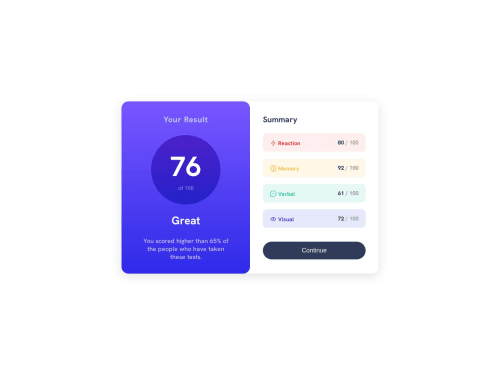
Skip to content
  • Learning paths
  • Challenges
  • Solutions
  • Articles
  • Unlock Pro
  • Log in with GitHub
Solution
Submitted over 1 year ago

Responsive result summary created by using HTML and CSS

PoteznyMocarz•540
@PoteznyMocarz
A solution to the Results summary component challenge
View live sitePreview (opens in new tab)View codeCode (opens in new tab)

Solution retrospective


I've created responsive result summary page, if you have any advice please write it in comments section 😁

Code
Select a file

Please log in to post a comment

Log in with GitHub

Community feedback

  • Daniel Barda•240
    @daniel-barda
    Posted over 1 year ago

    Hey, Nice job.

    But note that at about 738px, your design breaks.

    You can fix this with another Media query .

    Alternatively, you can use minmax and auto-fit And thus save you the Media queries.

    I leave it to you for reference

    https://css-tricks.com/auto-sizing-columns-css-grid-auto-fill-vs-auto-fit/

    I hope this will be helpful for you. 😊

    Marked as helpful

Join our Discord community

Join thousands of Frontend Mentor community members taking the challenges, sharing resources, helping each other, and chatting about all things front-end!

Join our Discord
Frontend Mentor logo

Stay up to datewith new challenges, featured solutions, selected articles, and our latest news

Frontend Mentor

  • Unlock Pro
  • Contact us
  • FAQs
  • Become a partner

Explore

  • Learning paths
  • Challenges
  • Solutions
  • Articles

Community

  • Discord
  • Guidelines

For companies

  • Hire developers
  • Train developers
© Frontend Mentor 2019 - 2025
  • Terms
  • Cookie Policy
  • Privacy Policy
  • License

Oops! 😬

You need to be logged in before you can do that.

Log in with GitHub

Oops! 😬

You need to be logged in before you can do that.

Log in with GitHub

Oops! 😬

You need to be logged in before you can do that.

Log in with GitHub