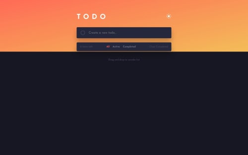
Responsive todo app using HTML, Sass, and vanilla JS

Solution retrospective
This todo app was built using HTML, Sass, and vanilla JavaScript, with all CRUD operations being carried out in the browser's local storage.
I used a mobile-first design philosophy while coding the markup according to the desktop version, which allowed for a more streamlined process when styling the page.
If anyone has any suggestions on how to make this code more efficient or how to make it adhere more closely to industry best practices when it comes to things such as syntax and use of certain methods/properties, I welcome any feedback.
Thank you for taking the time to look at my project.
Please log in to post a comment
Log in with GitHubCommunity feedback
No feedback yet. Be the first to give feedback on Venus’s solution.
Join our Discord community
Join thousands of Frontend Mentor community members taking the challenges, sharing resources, helping each other, and chatting about all things front-end!
Join our Discord