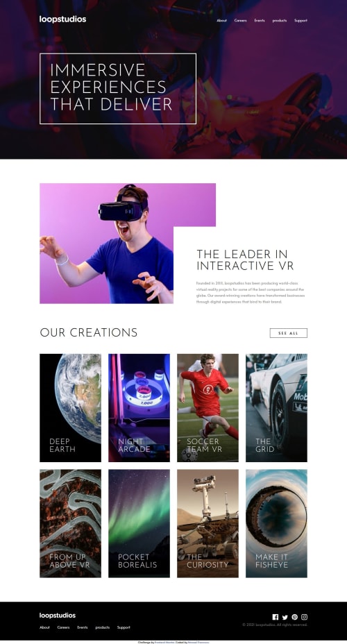
Responsive VR Landing Page using CSS Grid and Flexbox

Solution retrospective
I am most proud of achieving a highly responsive design that looks great on all screen sizes, from mobile devices to large desktop monitors. I successfully utilized CSS Grid and Flexbox to create a flexible layout. Next time, I would focus more on optimizing image loading and performance, perhaps by implementing lazy loading for images to enhance page speed.
What challenges did you encounter, and how did you overcome them?One of the main challenges was ensuring that the navigation menu worked seamlessly on both desktop and mobile devices. I overcame this by using a combination of CSS Grid for the layout and JavaScript to handle the toggle functionality for the mobile menu. Additionally, handling different image resolutions for various screen sizes required careful use of the `` element and srcset.
I would like feedback on the JavaScript used for the mobile navigation toggle. Specifically, I'm interested in making sure that the code is clean, efficient, and follows best practices. Additionally, any tips on further improving the responsiveness and performance of the site would be greatly appreciated.
Please log in to post a comment
Log in with GitHubCommunity feedback
No feedback yet. Be the first to give feedback on Manuel francisco’s solution.
Join our Discord community
Join thousands of Frontend Mentor community members taking the challenges, sharing resources, helping each other, and chatting about all things front-end!
Join our Discord