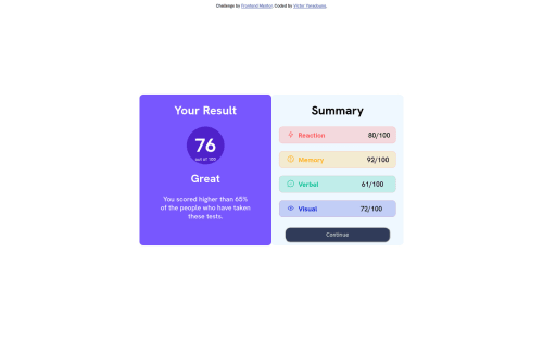
Result Summary Component Using HTML and CSS

Solution retrospective
Actually I tried to align correctly the numbers or mark( 80/100; 61/100) and I can't make the mobile design of the website even though I tried using media queries.
Please log in to post a comment
Log in with GitHubCommunity feedback
- @visualdenniss
Your solution looks great. To make it responsive, just add flex-direction: column; like so:
@media (min-width: 375px) .main { min-width: 10%; display: flex; flex-direction: column; }
Additionally you can add a cursor:pointer to your button to indicate users that it is clickable or add a background-color change on hover with button:hover { background-color: a-color-of-your-choice }
Hope you find this feedback helpful!
Marked as helpful - @MooseCowBear
It looks like your media query only changes the width. You should think about the relative orientation of the halves of the design. In the desktop, we want them to sit side by side. But in the mobile design we want them to sit one on top of the other. One way you can accomplish this is if you change the display of your "main" div to flex you can have the desktop version keep the default flex-direction of row, and in your media query, change the flex-direction to column.
This isn't the only way to achieve the change of orientation, just one option.
Also, there is an html tag <main> that is intended to do what you "main" div is doing but in a way that is more accessible.
Marked as helpful - @0xabdulkhaliq
Hello there 👋. Congratulations on successfully completing the challenge! 🎉
- I have other recommendations regarding your code that I believe will be of great interest to you.
HTML 🏷️:
- This solution generates accessibility error reports due to
non-semantic
markup, which lack landmark for a webpage
- So fix it by replacing the element
<div class="main">
the with semantic element<main>
along with<div class="attribution">
the with semantic element<footer>
in yourindex.html
file to improve accessibility and organization of your page.
- What is meant by landmark ?, They used to define major sections of your page instead of relying on generic elements like
<div>
or<span>
- They convey the structure of your page. For example, the
<main>
element should include all content directly related to the page's main idea, so there should only be one per page
I hope you find this helpful 😄 Above all, the solution you submitted is great !
Happy coding!
Join our Discord community
Join thousands of Frontend Mentor community members taking the challenges, sharing resources, helping each other, and chatting about all things front-end!
Join our Discord