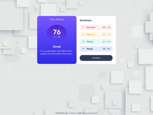
Submitted over 2 years agoA solution to the Results summary component challenge
score result page using html and css
LVL 1

@adeycodes
Solution retrospective
During the challenge, I find it difficult to make it responsive to the requires mobile screen size and also it took me sone tine before i could approximately give out the desired values for the viewport of the web page. some aspect of CSS selectors looks kind of ambiguous. I look forward to continuous learning and become better.
Code
Loading...
Please log in to post a comment
Log in with GitHubCommunity feedback
No feedback yet. Be the first to give feedback on Emmanuel Adeyefa’s solution.
Join our Discord community
Join thousands of Frontend Mentor community members taking the challenges, sharing resources, helping each other, and chatting about all things front-end!
Join our Discord