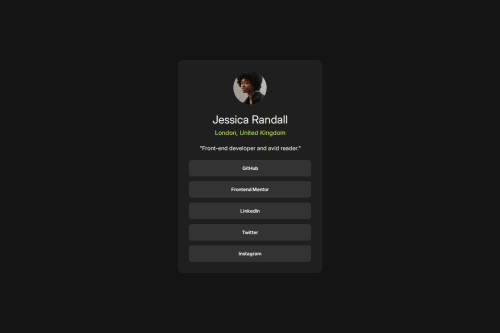
Social links profile

Solution retrospective
Consistent Use of CSS Variables: You’ve used variables for colors, font sizes, and weights, which makes your code scalable and maintainable.
- Responsive Design: The use of a media query (@media (max-width: 40em)) shows awareness of responsiveness.
- Semantic Class Naming: Your class names like .profile-card, .profile-info, and .btn are intuitive and readable.
- Hover Effect: You added good user interaction feedback with :hover styles.
- Centered Layout Using Grid: place-content: center on body is a great choice for vertically and horizontally centering the card.
One of the main challenges I encountered was ensuring that the layout looked consistent across different screen sizes. Initially, the fixed min-width of the .profile-card caused horizontal overflow on smaller mobile devices, which broke the user experience.
To overcome this, I implemented a responsive media query using @media (max-width: 40em) to reduce the card's min-width for smaller screens. I also tested the design on different device widths using browser dev tools and adjusted padding and font sizes where necessary to improve readability and spacing.
Another challenge was managing the color contrast to ensure good accessibility. For example, the hover effect on buttons needed to have enough contrast to remain readable. I used a combination of online contrast checkers and visual testing to fix those issues.
What specific areas of your project would you like help with?Open to feedback
Please log in to post a comment
Log in with GitHubCommunity feedback
No feedback yet. Be the first to give feedback on Sunday Alabi’s solution.
Join our Discord community
Join thousands of Frontend Mentor community members taking the challenges, sharing resources, helping each other, and chatting about all things front-end!
Join our Discord