Submitted about 1 year agoLVL 2A solution to the Single-page design portfolio challenge
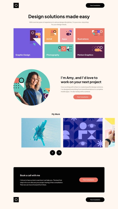
Tailwind CSS Grid Layout and Absolute Positioning
react, tailwind-css, svelte

P
@MiJouHsieh
Solution retrospective
What are you most proud of, and what would you do differently next time?
- I successfully tackled one of my weakest areas, CSS Grid, and implemented a responsive layout that adapts well to different screen sizes.
- In the My Work section, I used position: absolute to allow child elements to extend beyond the parent container’s padding, creating a visually dynamic effect.
- I leveraged translateX in the My Work section to ensure the selected item is perfectly centered within the block, improving the user experience.
Code
Loading...
Please log in to post a comment
Log in with GitHubCommunity feedback
No feedback yet. Be the first to give feedback on MiJouHsieh’s solution.
Join our Discord community
Join thousands of Frontend Mentor community members taking the challenges, sharing resources, helping each other, and chatting about all things front-end!
Join our Discord