Submitted about 2 months agoA solution to the Testimonials grid section challenge
Testimonials grid section
LVL 1

@mohamedHodaib
Solution retrospective
What are you most proud of, and what would you do differently next time?
What I am most proud of
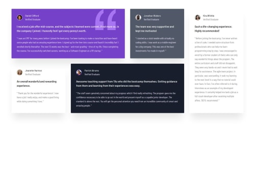
I am most proud of successfully implementing a complex CSS Grid layout that remains responsive across different screen sizes. Specifically:
- Grid Area Management: Successfully using
grid-columnandgrid-rowto create the asymmetric "bento" layout, particularly making Kira's card span both rows on desktop. - Clean Styling: Using CSS custom properties (variables) to manage the color palette efficiently, making the code much easier to maintain and update.
- Background Details: Correcting the placement of the quotation SVG in the first card using
background-positionto match the design exactly.
- Mobile-First Approach: I started with the desktop design and moved to mobile. Next time, I would write the mobile styles first. This usually leads to cleaner CSS and fewer overrides in media queries.
- Accessibility (A11y): I would like to include more ARIA labels and ensure the contrast ratios are strictly following WCAG guidelines to make the site more inclusive.
- Component Reusability: Instead of generic classes, I would try using a methodology like BEM (Block Element Modifier) to make my classes more descriptive and reusable across different projects.
I want a feedback on grid implementation
Code
Loading...
Please log in to post a comment
Log in with GitHubCommunity feedback
No feedback yet. Be the first to give feedback on mohamed hodaib’s solution.
Join our Discord community
Join thousands of Frontend Mentor community members taking the challenges, sharing resources, helping each other, and chatting about all things front-end!
Join our Discord