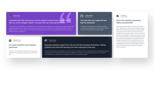
Testimonials grid section

Solution retrospective
I feel like this project took me less effort and I really feel like I've improved a lot since the first project, and that's what I'm the most proud of.
What challenges did you encounter, and how did you overcome them?I was struggling for a while with centering the layout and I ended up using flexbox on the html tag, but I'm almost certain that's not the best practice.
What specific areas of your project would you like help with?I got a few...
-
While checking the page on the responsive design mode I noticed that on bigger tv sized the design either looked too small or too bloated and I don't know what's the best choice on those larger screen sizes.
-
I'm terrible with box-shadows any tips are welcome.
-
For whatever reason my design on the comparison looks different from the one in github.
-
Where am I suppose to put the h1 tag if there is no title?
-
Any other criticisms are welcome.
Please log in to post a comment
Log in with GitHubCommunity feedback
No feedback yet. Be the first to give feedback on KennethVelazquez’s solution.
Join our Discord community
Join thousands of Frontend Mentor community members taking the challenges, sharing resources, helping each other, and chatting about all things front-end!
Join our Discord