The Wise Boiled Potato

Solution retrospective
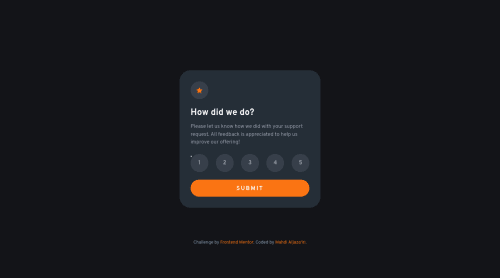
I decided to breach the design instructions regarding active states of radio buttons. The design suggests that a checked radio button would acquire a light gray background, whereas a hovered-over one would get an orange background. This is in my opinion pretty misleading.
Normally, people associate a change of color with a change of state, and a big change of color with a samely big change of state. If a radio button was gray then turned orange, a user might suggest it has got checked! So, I flipped colors. A checked radio is orange, and a hovered-over one is light gray.
What do you think about this? Well done? Na-ah?
Please log in to post a comment
Log in with GitHubCommunity feedback
No feedback yet. Be the first to give feedback on Mahdi Aljaza'iri’s solution.
Join our Discord community
Join thousands of Frontend Mentor community members taking the challenges, sharing resources, helping each other, and chatting about all things front-end!
Join our Discord