Community insights: responsive web design tips and tricks
Want your website to look good on any device? Learn from the community's experience building responsive layouts and get advice on what to consider when making your own projects.
Table of contents
- Plan your layout before you code
- HTML is responsive by default
- A mobile-first approach can help your workflow
- Media queries and breakpoints in responsive design
- Frameworks can help you create responsive layouts
- CSS units matter
- Use modern CSS techniques to create responsive UIs
- Utilize developer tools to test your layout
- Resources for learning more about building responsive layouts
- Responsive design challenge roadmap on Frontend Mentor
- Add your thoughts to the discussion
In the current web landscape, responsive design isn't just a luxury; it's a necessity. Given the amount of devices available to users, a website must provide an optimal viewing experience across all screen sizes. But how do the devs approach this challenge?
Each week, we ask our community a question on a specific topic related to web development. In one of our recent discussions, we asked our community, "How do you create a responsive web design for all devices? What steps do you take?"
Here's a summary of what they had to say 👇
Plan your layout before you code
 Diving straight into coding, especially with HTML, without a roadmap can lead to unnecessary complexities. To achieve a fluid, responsive design, it's crucial to study various responsive designs before you even start building your HTML structure.
HTML is responsive by default
A great reminder – HTML is responsive by default. It's our CSS additions that can make it unresponsive. So, consider this: rather than making an existing design responsive, prevent it from becoming unresponsive in the first place.
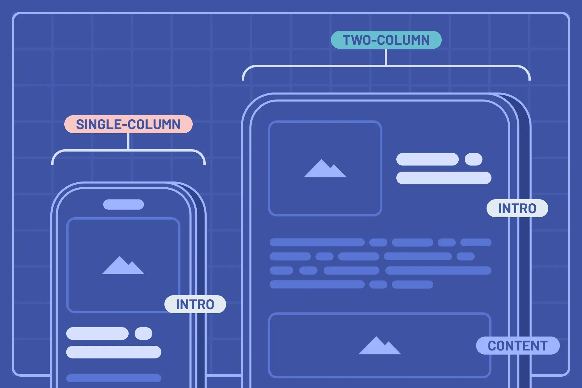
A mobile-first approach can help your workflow
 Many of our community members highlighted the importance of the mobile-first approach. With a lot of internet traffic coming from mobile phones, it makes sense to design for the smallest screens first and scale upwards. This approach ensures that as the screen gets bigger, design decisions are additive, rather than having to strip away features or design elements for smaller screens.
Media queries and breakpoints in responsive design
While there's a debate about fixed breakpoints, some common resolutions are frequently mentioned:
-
Standardized breakpoints: Some developers favor specific resolutions for mobile, tablet, and larger screens (e.g., 768px for tablet).
-
Content-first breakpoints: An insightful viewpoint suggests breakpoints shouldn’t be device-driven but content-driven. Introduce media queries when the design disrupts the content, making the process more organic.
Frameworks can help you create responsive layouts
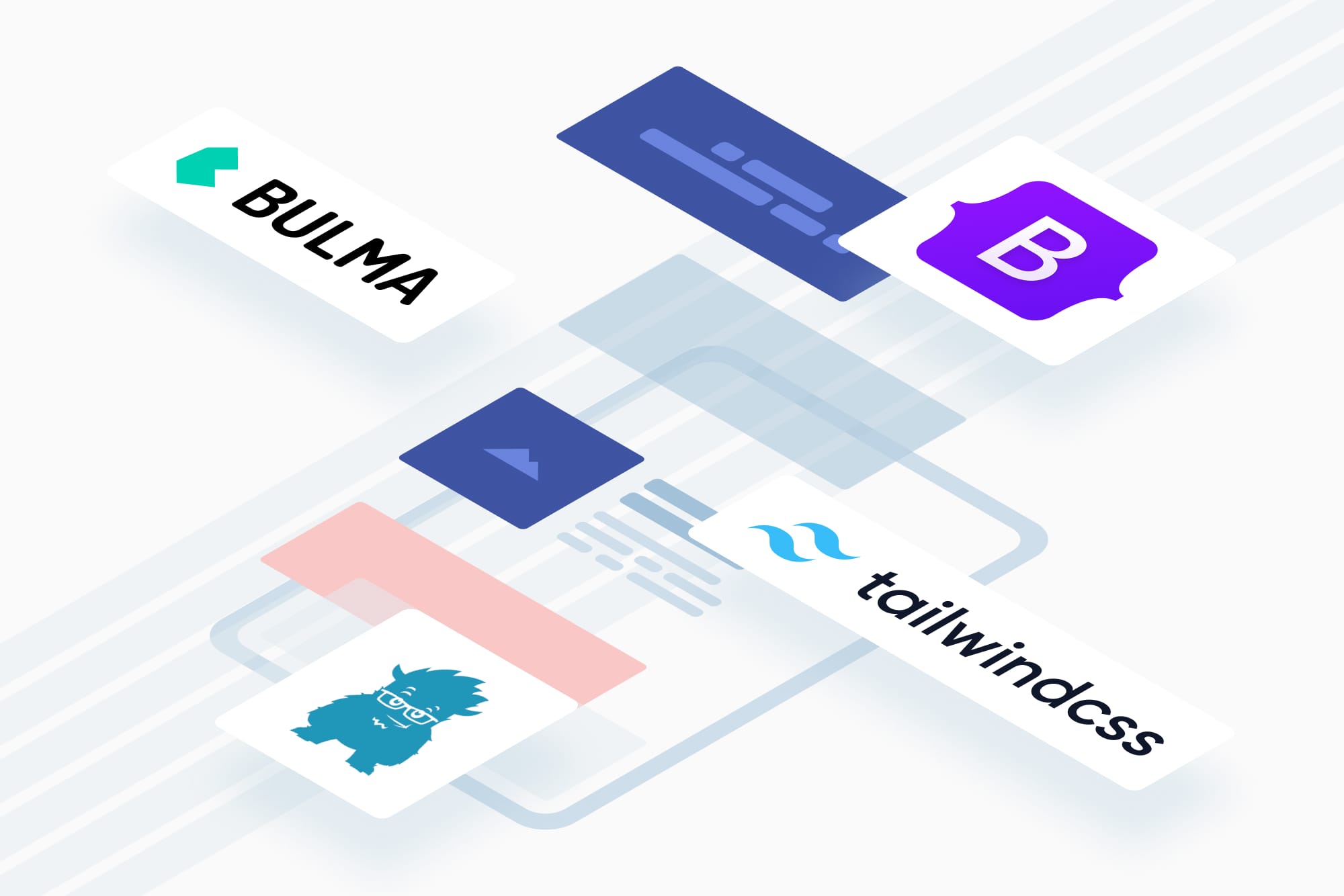 Frameworks like Bootstrap, Tailwind, and Bulma are helpful. They offer a toolkit of ready-to-use components and styles that can accelerate the design process. But remember: while they provide an edge, there's no substitute for understanding plain CSS.
CSS units matter
The battle of units in web design has longstanding champions: relative units. Units like em, rem, and % adjust in relation to their context, ensuring the design remains harmonious across resolutions. It is essential to understand the subtle differences - like em scaling with its parent's font size and rem with the root font size. Opt for relative units like em, rem, and % instead of fixed units. These relative units ensure that elements scale proportionally to their surroundings or the base size, facilitating more fluid designs.
Use modern CSS techniques to create responsive UIs
Modern CSS offers tools that make responsiveness more intuitive:
-
Dynamic CSS functions: Utilize functions like
clamp()to provide a dynamic range of values, ensuring elements fit perfectly irrespective of the screen size. -
Modern layout mechanisms: With Flexbox and CSS Grid, you can build detailed layouts that naturally adapt to different screens. These tools have transformed the way designers think about web layouts.
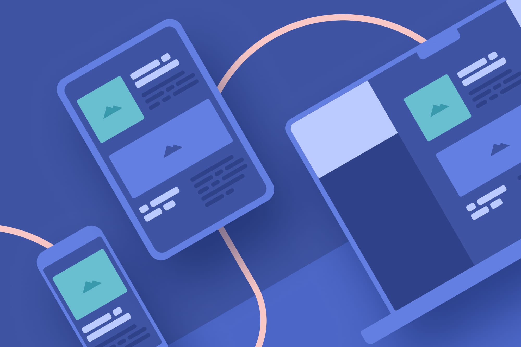
Utilize developer tools to test your layout
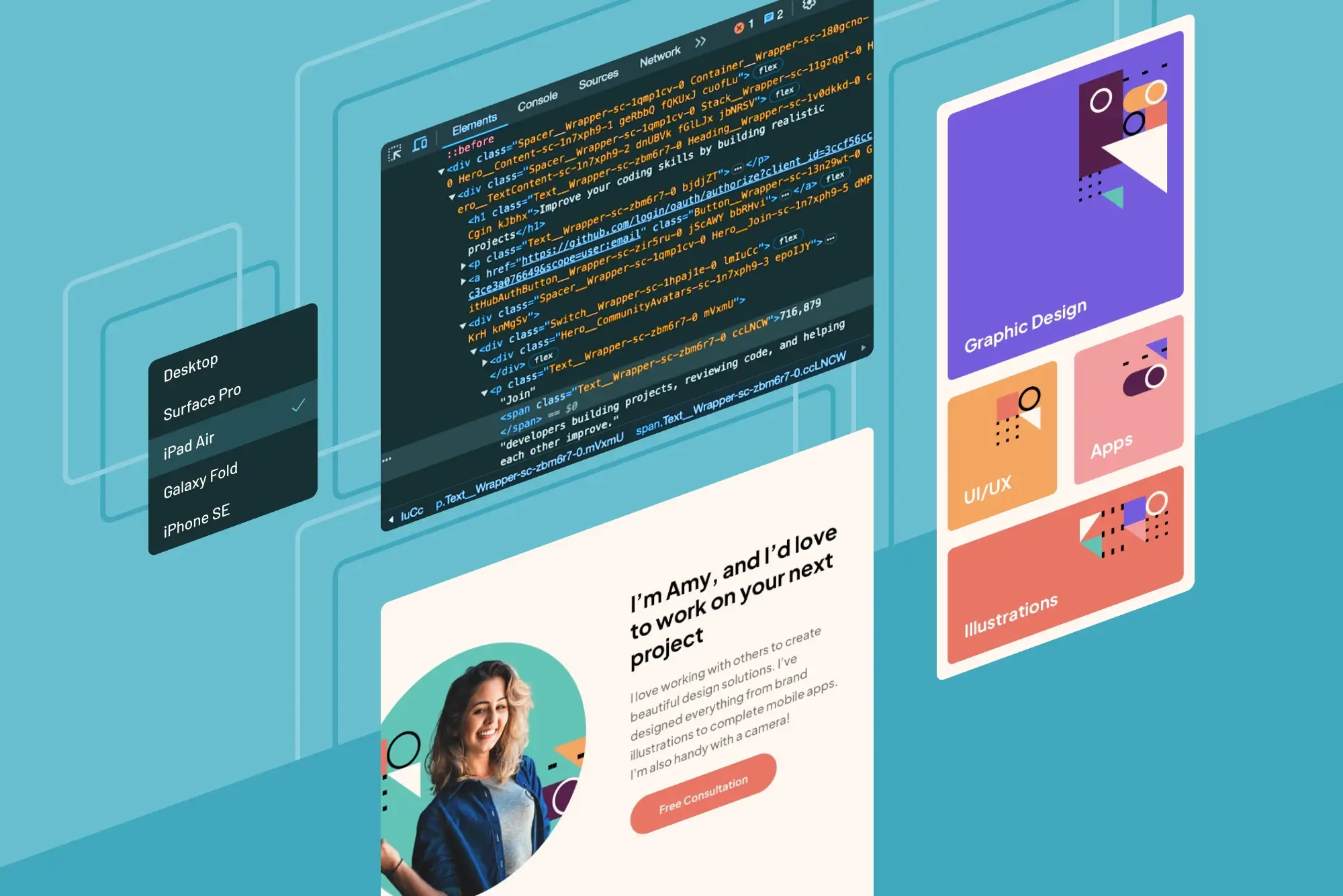 Chrome's developer mode and similar tools in other browsers are invaluable. They allow you to simulate different device views. Before finalizing, preview the website across varying screen resolutions, starting from the smallest. It’s advisable to start from the smallest devices and scale upwards, ensuring each resolution offers a seamless user experience.
Resources for learning more about building responsive layouts
Some community members shared some great learning resources for learning responsive design. Namely:
Responsive design challenge roadmap on Frontend Mentor
In the Frontend Mentor Discord community, we have a channel dedicated to challenge roadmaps. We have a list of recommended challenges to take to work on responsive design, as well as a list of handpicked helpful resources. Check out our “Building responsive layouts” challenge roadmap.
Add your thoughts to the discussion
If you have any thoughts or experiences building responsive layouts that you think the community would benefit from reading about, please feel free to add to the discussion in Discord.
Take your skills to the next level
- AI-powered solution reviews
- 50+ portfolio-ready premium projects
- Professional Figma design files