Figma for developers: How to work with a design file
Figma is a popular design tool that you'll probably use at some point in your development career. This article outlines how to work with a design file to build more accurate projects.
Table of contents
Collaborating with designers is a crucial part of your job as a developer. Thanks to its powerful features and collaborative nature, Figma has become the go-to tool for many design teams. Understanding how to navigate Figma and work effectively with design files will help you streamline your development process.
Our goal at Frontend Mentor is to help you get job-ready and practice building projects using a real-life workflow. That’s why we include Figma designs in our challenges. Using professional tools used in companies worldwide will help you prepare for life as a professional developer or help you level up if you’re already a professional.
In this article, I’ll share some essential tips and shortcuts to help you get the most out of Figma as a developer.
Navigating the Figma interface
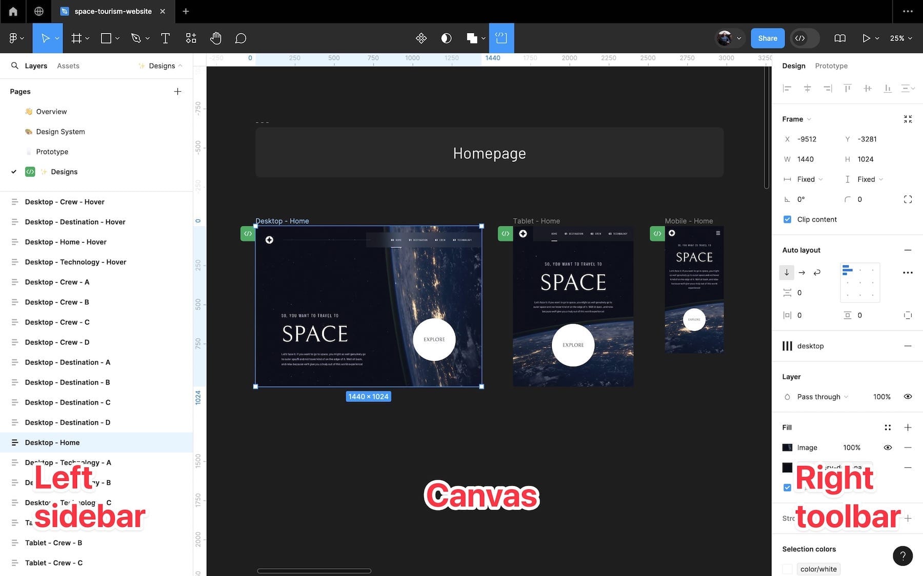
When you first open a Figma file, it's important to familiarize yourself with the interface. Here are the key areas to know:
- Canvas — This is where the designs are located in the center of the screen.
- Left Sidebar — This sidebar contains layers, assets, and pages for easy navigation. You’ll mostly use it to navigate the design file and explore layers.
- Right Toolbar — Shows information about selected elements, including CSS code, local styles and variables, and more. It is where you’ll get most of the information you need to help write your code.
As you’re moving around the design file, it’s useful to know some shortcuts to navigate the canvas efficiently:
- Zoom in/out:
Cmd ⌘ + Scroll(Mac) orCtrl + Scroll(Windows) - Pan canvas:
Spacebar + Drag - Zoom to selection:
Shift + 2 - Zoom to fit:
Shift + 1 - 100% Zoom:
Shift + 0
Understanding the project
Now that you know the basic interface and a few shortcuts, let’s dig into how you can get yourself acquainted with the project to understand what you’re building.
Prototype

Your design file may or may not contain a prototype (we’re currently updating our designs to add them). A prototype is a simple, interactive version of the design that helps anyone working on the project understand how everything fits together. If your design file contains a prototype, take some time to click around and understand the project. This is especially helpful on larger projects where there are more moving parts and complexities.
You can also click the play icon in the top right and select “Preview” to create a small pop-out window of the prototype, as shown below:

The prototype preview is helpful if you need a quick reminder of the prototype without opening up a new tab in Figma.
Design system
Not all design files contain a design system. If you work in a company with well-defined systems, you may well encounter one. But it’s equally likely that you’ll be given a design file without one and need to extract the details yourself (which we’ll dig into later).
Design systems help you see all repeatable styles, patterns, and components at a glance. Inside our design files, we include a design system page with a style guide and components with their variants.
The style guide will help you set up your code with reusable styles for things like colors and typography.
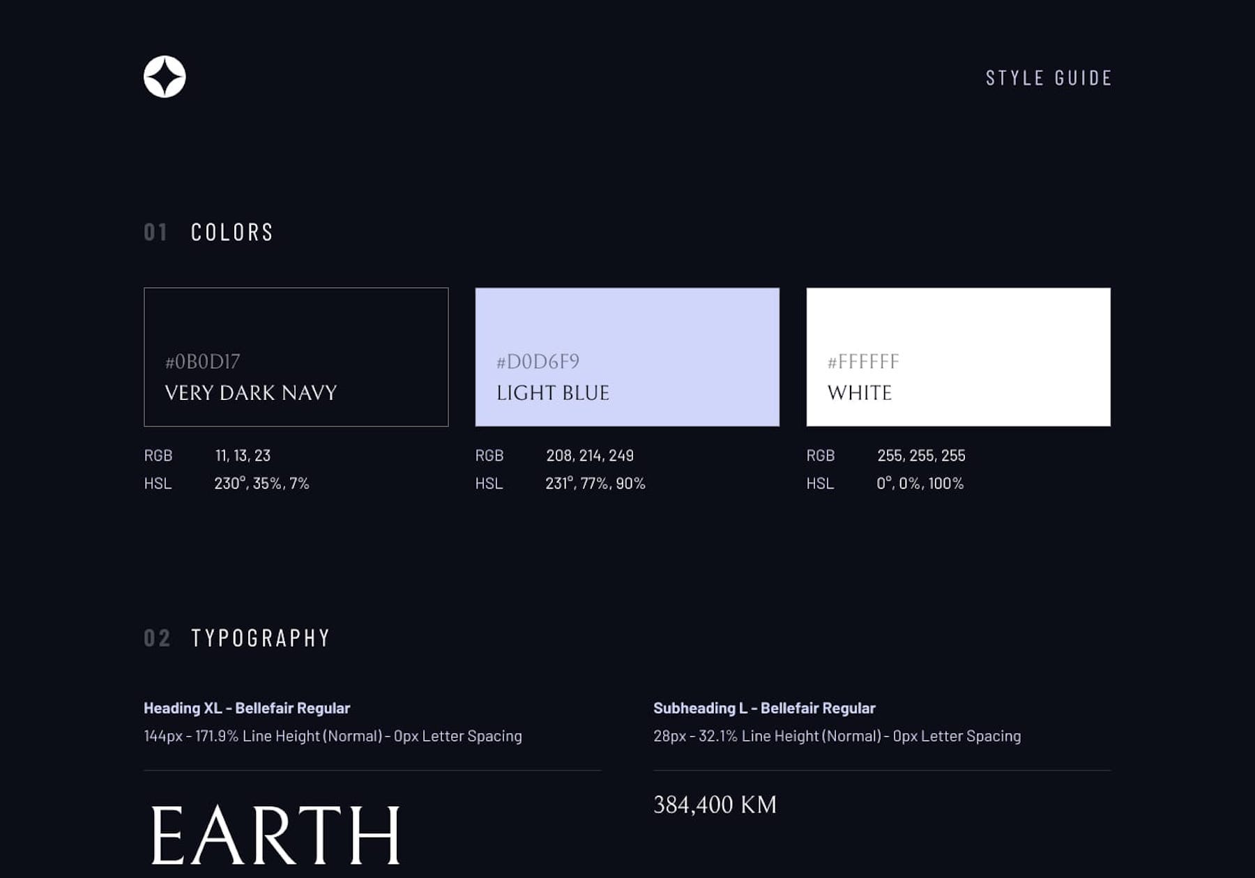
The components are useful as they’re used throughout the design file and display their various states.

Note: All our premium challenge Figma files include basic design systems, which we’re currently updating with some improvements.
Inspecting elements and getting information from the design file
Now that you’ve got a good understanding of the project, are comfortable navigating the canvas, and maybe even have some styles set up in your code, let’s look at how you can inspect elements.
The way you inspect the design file will differ depending on whether you’re a paid Figma subscriber or not. You can still get all the information you need as a free user; it’s just a slightly different workflow. I’ll review common approaches for both.
All Figma users
Local styles and local variables
Designers often use local styles and local variables in Figma to store reusable values, like colors and spacings. Combined with the design system (if you have one), this is where you’ll find common styles you can use in your base CSS setup. Creating reusable styles is an important part of writing good CSS, so this is a good place to start.
Variables are more powerful, allowing for additional benefits like automated variable naming for CSS properties. It’s common to see some values stored as styles and some as variables. Both are accessed through the right toolbar, as shown below.

Inspecting elements
Not all design files will use variables or styles. You may find that some values are set individually throughout the file. Whether or not values are applied using styles, variables, or set values, learning how to inspect elements and extract properties is a skill for any developer.
To select nested elements, use Cmd + ⌘ + Click (Mac) or Ctrl + Click (Windows) when hovering over the element you wish to inspect. Once selected, you’ll see the element’s styles in the right toolbar, just like the paragraph’s styles shown below.

You can also dig into the variable styles further (or view the variable list in the same way mentioned above) in the right toolbar by clicking through, shown below.

As you can see from the images above, you can retrieve all the information necessary to write accurate CSS code and create reusable styles. Sometimes, properties won’t be stored as variables or local styles, but they will still be accessible through the right toolbar as their raw value, which you can use in your CSS code.
You can also see information at the top of the right toolbar like width, which will help you further (although you wouldn’t take the pixel value straight from the design file).
Measuring spacings
One of the most tricky parts of front-end development is figuring out spacings. Not getting them right can make the difference between your UI looking near pixel-perfect, or way off from what the designer intended. So, it’s a good idea to get good at inspecting spacing.
It’s actually pretty simple to do. Just select your element, hold Option (Mac) or Alt (Windows) and hover over the element you want to measure the distance between.

Some designers will use spacing variables, at which point you can match the value up to the relevant variable and use it. Whereas others won’t use variables, so you can create your own in your code in order to reuse it if it’s a common value.
Exporting assets
Our challenges all include pre-exported and optimized assets in the starter code. However, you may find yourself on a team where you’re expected to export the assets (or you might want to just grab a different resolution image for a challenge). So, understanding how to export assets will help.
Firstly, select the element in the same way as before. The designer should mark all assets for export, which means you can open the Export section at the bottom of the right toolbar and choose your export settings (e.g., resolution, and image format). Click export, choose a location, and then you’re good to go!

Before you use the image in your project, remember to optimize it. Unoptimized images contribute to bloated, slow websites, so you want to ensure your images are no larger than necessary. ImageOptim is a useful tool for Mac users. Alternatively, online tools like TinyPNG are good for quick, free optimization.
Paid Figma subscribers
As you can see from the features listed above, you don’t necessarily need to pay for Figma to extract all the information you need to create accurate projects. However, if you do have a subscription, Figma’s Dev Mode definitely brings some benefits.

As you can see from the image above, turning on Dev Mode immediately changes the left panel and right toolbar to become much more contextual to a developer’s workflow.

Inspecting the same paragraph element in Dev Mode, you can see we get much more information up front and it’s more easily accessible. Spacing variable names are shown (if the designer has used them), we have a nice typography diagram, and we even have a CSS code snippet providing useful information at a glance.
These are the areas of Dev Mode you’ll probably find most useful while completing our challenges. But it also offers many benefits in a professional setting:
- Design handoff: With Dev Mode, designers can clearly indicate which parts of the design are ready for implementation. This allows developers to focus on the relevant elements without getting sidetracked by unfinished work.
- Collaboration and clarity: Dev Mode offers a dedicated space for designers to provide developer-specific information, such as annotations, interaction details, and design rationale. This improves communication and reduces misinterpretation, leading to smoother collaboration.
- Design evolution tracking: Developers can easily compare different versions of a design within Dev Mode, similar to version control systems like Git. This helps them understand how the design has progressed over time and identify any changes that need to be implemented.
- Integration with developer tools: Dev Mode connects with popular developer tools such as Jira (for project management), Storybook (for component library documentation), and GitHub (for version control). This allows developers to access relevant code repositories, documentation, and tasks directly from within Figma.
Conclusion
Learning to work with design files is a skill, just like any other aspect of web development. The more you practice, the faster you’ll become at interpreting design files and building accurate UIs while writing high-quality, reusable code.
Whether you’re using the free or paid version of Figma, becoming proficient with design files will be a massive help in your career.
To help get some practice using Figma, we have a few “free+” challenges that have a Figma file included. I recommend giving them a go in order to gain experience using this valuable tool.
- QR code component: This is our smallest challenge and an excellent place to get started working with Figma.
- Blog preview card: Another opportunity to use a Figma file on a less complex challenge.
- Space tourism multi-page website: This is the design file used in this article. It is one of our improved Figma files. Even if you’re not ready to take on this project, we recommend looking at the design file to get an idea of how a design file for a larger project might look.
Practice is crucial to becoming a competent, confident developer. If you want to practice using the same workflow professional developers use, it may be worth checking out our Pro subscription.
As a Pro subscriber, you’ll have access to Figma designs for all challenges. This will help you build more accurate solutions faster while gaining experience using professional tools. You also get access to our premium challenges, which are our highest-quality and most realistic projects, helping you showcase your skills.
Keep practicing, and happy coding!
Take your skills to the next level
- AI-powered solution reviews
- 50+ portfolio-ready premium projects
- Professional Figma design files