
How to efficiently manage CSS classes in React
Managing CSS classes in React can be tricky. Especially once you start conditionally updating styles based on state. In this article, Andrew outlines a few approaches and compares their merits.
Table of contents
When building applications in React, we often want components to dynamically change their appearance based on user interactions. These changes are easily achieved by using conditional CSS classes, which are applied or removed based on specific conditions.
In React, these classes are commonly applied based on a component's prop values or state. The ternary operator is frequently used to manage the application of these classes. The code snippet below is an example of this common approach:
import styles from "./button.module.css"

function Button({variant}){
  return (
    <button className={`${styles.base} ${variant ? styles[variant] : ""}`}>
       {children}
    </button>
  )
}

export default Button;
This approach is typical for building small components. However, as the component becomes more flexible and more props are introduced to handle this flexibility, keeping track of the available CSS classes and the conditions under which they are applied becomes difficult. The button component could end up looking like this:
import styles from "./button.module.css"

function Button({variant, type, size}){
  return (
    <button className={`${styles.base} ${variant ? styles[variant] : ""} ${type ? styles[type] : ""} ${size ? styles[size] : ""}`}>
      {children}
    </button>
  )
}

export default Button
The length of the conditional CSS classes' application logic on the element makes it difficult to understand how the CSS classes are being applied to the element. This difficulty could make debugging your code challenging. Efficiently applying CSS classes becomes essential not just for your future self but for other developers who might work on the project.
This article will explore the efficient techniques for managing conditional CSS classes in a React application.
Prerequisites
To get the most out of this article, you will need to:
-
Have basic knowledge of React
-
Be familiar with CSS modules
-
Be familiar with ES6 syntax
-
Have Node.js installed
Project setup
We will be building a button component with the following props:
-
variant: solid, outlined, and text
-
type: primary, success, and danger
-
size: sm (small), md (medium), and lg (large)
To follow along, you will need to create a new React application. You can do that by executing this command in your terminal:
npm create vite@latest <project_name> -- ---template react
Change to your project directory once it has been created, and execute the below command to install the necessary dependencies for your project:
npm install
With the necessary dependencies installed, let's make a few changes to our new React application. First, delete the App.css file. We don't need it for this project because we will use CSS modules to style the button component.
Next, create a new components directory inside the src directory. Then, create two new files in the components directory: Button.jsx and button.module.css.
Copy and paste the following CSS styles into the button.module.css file:
/* button base style */
.base {
  color: #fff;
  font-weight: bold;
  font-size: 0.75rem;
  padding: 4px;
  cursor: pointer;
  border-radius: 6px;
}

/*Button variant styles */
.solid,
.text {
  border: none;
}

.outline,
.text {
  background-color: transparent;
  color: rgb(133, 133, 133);
}

.outline {
  border: 2px solid rgb(133, 133, 133);
}

/* button types style */
.primary {
  background-color: #3b82f6;
}

.success {
  background-color: #22c55e;
}

.danger {
  background-color: #ef4444;
}

/* Compound button styles */
.solid-primary {
  background-color: #3b82f6;
}

.text-primary,
.outline-primary {
  background-color: transparent;
  color: #3b82f6;
}

.outline-primary {
  border: 2px solid #3b82f6;
}

.solid-success {
  background-color: #22c55e;
}

.text-success,
.outline-success {
  background-color: transparent;
  color: #22c55e;
}

.outline-success {
  border: 2px solid #22c55e;
}

.solid-danger {
  background-color: #ef4444;
}

.text-danger,
.outline-danger {
  background-color: transparent;
  color: #ef4444;
}

.outline-danger {
  border: 2px solid #ef4444;
}

/* button size styles */
.sm {
  font-size: 0.875rem;
  padding: 6px;
}

.md {
  font-size: 1rem;
  padding: 8px;
}

.lg {
  font-size: 1.125rem;
  padding: 10px;
}
Next, replace the CSS styles in the index.css file with the following:
* {
  padding: 0;
  margin: 0;
  box-sizing: border-box;
}

body {
  min-height: 100vh;
  display: grid;
  place-items: center;
}
Next, copy and paste the following code into the Button.jsx file:
import styles from "./button.module.css"

function Button(){
  return <button className={styles.base}>Button</button>
}

export default Button;
Next, replace the contents of the App.jsx file with the following:
import Button from "./components/Button";

function App() {
  return <Button />;
}

export default App;
Finally, save all changes and execute the below command to start the development server:
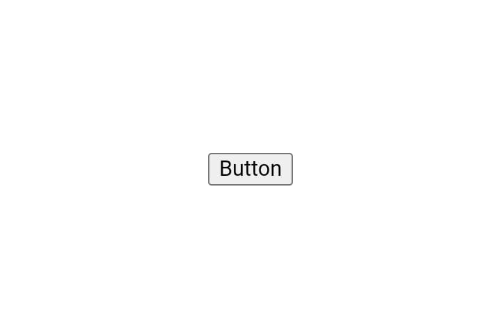
npm run dev
You should see the below button on your screen:

With the project all set up, let's look at the different methods for efficiently managing the application of conditional CSS classes in React.
Method 1: Manual method
The manual method involves creating an array of CSS classes and then using the Array.join() method to concatenate the classes into a string that will be applied to the component. Implementing this method in our button component:
import styles from "./button.module.css";

// Set the default values for some props
function Button({ variant = "solid", size = "md", type, children }) {
  // Create an array of class names based on props
  const classNames = [
    styles.base, // Base class
    styles[size], // Size-specific class
    styles[variant], // Variant-specific class
    styles[`${variant}-${type}`], // Variant and type-specific class
  ];

  // Concatenate the classes into a string
  const btnStyles = classNames.join(" ");

  return <button className={btnStyles}>{children}</button>;
}
In the above code snippet, we created a classNames array that contains all CSS classes used for styling the button. Then, we used the join() method to concatenate the array elements into a string.
We used the join() method instead of the toString() method because the string returned by the toString() method uses a comma as the delimiter to concatenate the CSS classes in the array. When applied to the element, this fails to produce the expected styles. For example, using the toString() method:
import styles from "./button.module.css";

// Set the default values for some props
function Button({ variant = "solid", size = "md", type, children }) {

  // Create an array of class names based on props
  const classNames = [
    styles.base,  // Base class
    styles[size],  // Size-specific class
    styles[variant],  // Variant-specific class
    styles[`${variant}-${type}`] // Variant and type-specific class
  ];

  // Using the toString method to Concatenate the classes into a string
  const btnStyles = classNames.toString();

  return <button className={btnStyles}>{children}</button>;
}
We get this button once we save the changes:
When we inspect the element in the browser DevTools:
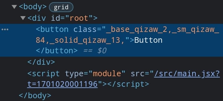
The classes are separated by a comma and applied on the button as a single class instead of separate classes. Using the join() method, we can pass a delimiter of our choice as an argument, in this case, a space, when we call the join() method.
When we revert our changes and save the file, we get this nice-looking button in the browser:

Pros of the manual method
-
Simple implementation: The manual method uses basic JavaScript, which makes its implementation easy as it requires no learning curve.
-
Improved code clarity: When contrasted with the inline method that uses ternary operators, it's easy to understand the code flow, making it a bit easier to debug.
-
No external dependencies: It doesn't rely on external libraries, reducing project dependencies.
Cons of the manual method
-
Code verbosity: The manual method may become less maintainable when dealing with more complex styling scenarios or larger projects. As the number of conditions and styles increases, the code could become convoluted and harder to manage.
-
No explicit conditions: It’s difficult to understand the conditions under which different CSS classes are applied to the element, which could make debugging the code difficult.
Method 2: Using the clsx library
clsx is a lightweight utility library used to manage the application of CSS classes. It's a simple function that accepts an object, array, or string as arguments and returns a string interpolation of the valid classes based on the provided conditions.
Execute the below command in your terminal to install the clsx library:
npm install clsx
With the clsx library installed, let’s refactor our Button component:
import clsx from "clsx";
import styles from "./button.module.css";

// Setting some default prop values
function Button({ variant = "solid", size = "md", type, children }) {
  const btnStyles = clsx({
    // Define class names as object properties
    // The base class for the button is always included
    [styles.base]: true,
    // Include the variant-specific class if the 'variant' prop is provided
    [styles[variant]]: variant,
    // Include the size-specific class if the 'size' prop is provided
    [styles[size]]: size,
    // Include a compound class if the 'type' prop is provided
    [styles[`${variant}-${type}`]]: type,
  });

  return <button className={btnStyles}>{children}</button>;
}

export default Button;
In the above code snippet, we called the clsx function and stored its return value in the btnStyles variable. We provided an object as an argument to the function, where each key represents a CSS class that is conditionally applied based on its associated values. The first class, set to a value of true, ensures that the class is always applied each time the button component is rendered. Subsequent keys are mapped to different props and are only applied when a value is passed to the respective props when the component is rendered.
You get the same nice-looking button after saving the file:
This approach could be further optimized, by checking if the prop has a valid value before applying the corresponding CSS class, rather than applying the CSS class associated with any of the props when the prop has a true value. This helps avoid situations where an undefined class could be applied due to an invalid prop value passed to either of the component props. To optimize this approach, we can proceed as follows:
import clsx from "clsx";
import styles from "./button.module.css";

function Button({ variant = "solid", size = "md", type, children }) {
  //Added an array of all the valid prop values
  const validVariants = ["solid", "outlined", "text"];
  const validTypes = ["primary", "success", "danger"];
  const validSizes = ["sm", "md", "lg"];

  const btnStyles = clsx({
    [styles.base]: true,
    // The classes are only applied when the prop has a true value
    // and the value is a valid option for the given prop
    [styles[variant]]: variant && validVariants.includes(variant),
    [styles[size]]: type && validSizes.includes(size),
    [styles[`${variant}-${type}`]]: type && validTypes.includes(type),
  });

  return <button className={btnStyles}>{children}</button>;
}

export default Button;
In the above code snippet, we created an array of valid values for each prop. Then, we used the && operator to ensure that the CSS class associated with a prop is only included if it has a true value and it is a valid option for the specific prop. This helps to prevent undefined CSS classes from being applied.
Pros of the clsx library method
-
Concise code:
clsxeliminates the need for verbose inline conditional statements, resulting in more compact and easily understandable code. -
Improved code clarity:
clsxenhances code clarity by explicitly defining the conditions for which each class is applied to the element, making it easier to understand and maintain compared to manual methods. -
Easier to maintain: Explicitly setting out the conditions for applying different CSS classes makes the code easier to understand and, therefore, more maintainable.
Cons of the clsx library method
- Additional dependency: Although
clsxis a small package (255B), it's still an extra dependency for your project, which should be considered.
Learning Curve: While not steep, additional time is still required to use the clsx library effectively.
Method 3: Using the class-variance-authority library
class-variance-authority (cva) is another utility library used for managing the conditional application of CSS classes in a component. The key difference between cva and clsx is the need to explicitly specify which styles are applied to the component in cva, based on the presence and combinations of the different props values provided when the component is rendered.
Execute the below command in your terminal to install the cva library:
npm install class-variance-authority
Refactoring the Button component, we now have:
import { cva } from "class-variance-authority";
import styles from "./button.module.css";

function Button({ variant, type, size, children }) {
  const btnStyles = cva([styles.base], {
    variants: {
      variant: {
        solid: styles.solid,
        outline: styles.outline,
        text: styles.text,
      },
      type: {
        primary: styles.primary,
        success: styles.success,
        danger: styles.danger,
      },
      size: {
        sm: styles.sm,
        md: styles.md,
        lg: styles.lg,
      },
    },
    compoundVariants: [
      {
        variant: "solid",
        type: "danger",
        className: styles["solid-danger"],
      },
      {
        variant: "solid",
        type: "success",
        className: styles["solid-success"],
      },
      {
        variant: "outline",
        type: "primary",
        className: styles["outline-primary"],
      },
      {
        variant: "outline",
        type: "danger",
        className: styles["outline-danger"],
      },
      {
        variant: "outline",
        type: "success",
        className: styles["outline-success"],
      },
      {
        variant: "text",
        type: "primary",
        className: styles["text-primary"],
      },
      {
        variant: "text",
        type: "danger",
        className: styles["text-danger"],
      },
      {
        variant: "text",
        type: "success",
        className: styles["text-success"],
      },
    ],
    defaultVariants: {
      variant: "solid",
      size: "md",
    },
  });

  return  <button className={btnStyles({ variant, type, size })}>{children}</button>
}

export default Button;
In the above code snippet, we called the cva function with two arguments and stored its return value in the btnStyles variable, which is then invoked to return the appropriate classes. Let's break down each argument passed to the function:
-
The first argument is the CSS class, which will be applied whenever the
Buttoncomponent is rendered. This could either be a string or an array of class names. -
The second argument is an object with three properties:
variants,compoundVariants, anddefaultVariant. -
The
variantskey is mapped to an object that contains the various props as keys. Each prop is further defined with its possible values and the corresponding CSS class that should be applied when the prop matches one of these values. -
The
compoundVariantsproperty is an array of objects, each defining a combination of valid prop values and the corresponding CSS class to apply when the prop values match any defined combinations in thecompoundVariantarray. -
The
defaultVariantproperty holds the value of the default CSS classes to be applied when theButtoncomponent is rendered with either a missing prop value or without props.
We get the same button when we save the file:
Pros of the cva library
-
Code clarity: explicitly setting out the classes enhances code clarity, making it easier to understand your application and debug.
-
Greater control: By explicitly defining classes for each prop value and combination, this method gives you greater control over your component's appearance.
-
Eliminates unexpected side effects: The
cvalibrary syntax eliminates unexpected side effects by ensuring that classes are set based on the prop values of the component. This prevents issues like applying undefined classes, that we experienced while using theclsxlibrary.
Cons of the cva library
-
Learning curve: Time is required to learn how to use the
cvalibrary effectively, but the curve is not steep. -
Lengthy boilerplate code: This method requires explicit definitions for compound variants, increasing the code needed to get started.
-
Additional dependency: The cva is an extra dependency for your project, which should be taken into consideration.
Conclusion
Efficiently managing the application of conditional CSS classes is important for building scalable and maintainable components in a React application. In this article, we explored three efficient methods for managing the application of conditional CSS classes in a React application. The advantages and disadvantages outlined will hopefully help you decide on the right approach for your next project.
Choosing the right method depends on the project's scale, complexity, and personal preference. The manual method is a good choice for small personal projects due to its simplicity and lack of a learning curve, and it adds no extra dependency to your project. clsx is a better choice if an extra dependency and the time required to learn the library are not an issue because it provides an easier-to-understand syntax, which makes debugging your application easier than the manual method. The class-variance-authority method is a better alternative if you need a deterministic way of knowing what type of element will be rendered for any given combination of props in your project.
Additionally, using CSS modules, style component libraries like Material UI (MUI), or a CSS framework like Tailwind CSS for styling your components enhances the overall maintainability of your React project because these styling options keep your styles isolated, which helps prevent style conflicts.
Ultimately, whatever method you choose should align with the specific requirements of your project and your development preferences.
Further reading
Take your skills to the next level
- AI-powered solution reviews
- 50+ portfolio-ready premium projects
- Professional Figma design files