Submitted over 1 year agoA solution to the Testimonials grid section challenge
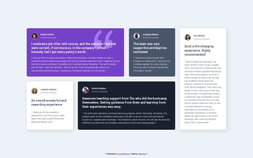
🌼 Testimonials grid section (HTML, CSS, Grid, Flexbox) 🌼
LVL 2

@helenhapp
Solution retrospective
What are you most proud of, and what would you do differently next time?
I tried my best to make it look good on mobile, desktop, and tablet. Using CSS Grid was fun. I used grid-template-areas and assigned grid-area to each card. I wonder if it was the best practice.
Code
Loading...
Please log in to post a comment
Log in with GitHubCommunity feedback
No feedback yet. Be the first to give feedback on Olena’s solution.
Join our Discord community
Join thousands of Frontend Mentor community members taking the challenges, sharing resources, helping each other, and chatting about all things front-end!
Join our Discord