Skip to content
  • Unlock Pro
  • Log in with GitHub
Solution
Submitted almost 2 years ago

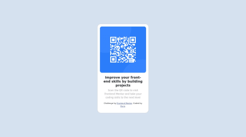
1st attempt to QR code component using Bootstrap

Purvi Patel•10
@ppatel6
A solution to the QR code component challenge
View live sitePreview (opens in new tab)View codeCode (opens in new tab)

Solution retrospective


All feedback is welcome

Code
Select a file

Please log in to post a comment

Log in with GitHub

Community feedback

  • Sadeesha Jayaweera•240
    @SadeeshaJayaweera
    Posted almost 2 years ago

    Congratulations on completing the challenge & all the very Best ✌️

    It sounds like you were trying to center a <div> container that holds your content by adjusting the margin-left property. While this approach can work in some cases, it may not be the most responsive and flexible way to achieve centering, especially for mobile views. There are more modern and responsive techniques you can use for centering content. Here's a better approach:

    1. Flexbox Centering: One of the most popular and responsive methods for centering content is using flexbox. To center a <div> horizontally and vertically, you can apply the following CSS to the container:

      .container {
        display: flex;
        justify-content: center; /* Center horizontally */
        align-items: center;     /* Center vertically */
      }
      

      This will work well for various screen sizes, including mobile, without having to set specific margin values.

    2. CSS Grid Centering: CSS Grid is another powerful tool for layout control. You can use it to center content as well. Here's an example:

      .container {
        display: grid;
        place-items: center;
      }
      

      This will center the content both horizontally and vertically within the container.

    3. Margin: 0 auto for Block-Level Elements: If you want to center a block-level element (like a <div>) horizontally, you can also use the margin: 0 auto; technique. This method is useful when you want to center a block horizontally within its parent container.

      .container {
        margin: 0 auto; /* Center horizontally within parent */
      }
      

      To center vertically as well, you can combine this with flexbox or grid as mentioned above.

    For responsiveness, it's also essential to consider using media queries to adjust your layout for different screen sizes. Media queries allow you to apply different CSS styles depending on the screen width, ensuring your content looks good on both desktop and mobile devices.

    Here's a basic example of a media query for mobile responsiveness:

    @media (max-width: 768px) {
      /* Your mobile-specific CSS styles go here */
    }
    

    In this query, styles inside the block will apply when the screen width is 768 pixels or less, allowing you to customize your layout for mobile devices.

Join our Discord community

Join thousands of Frontend Mentor community members taking the challenges, sharing resources, helping each other, and chatting about all things front-end!

Join our Discord
Frontend Mentor logo

Stay up to datewith new challenges, featured solutions, selected articles, and our latest news

Frontend Mentor

  • Unlock Pro
  • Contact us
  • FAQs
  • Become a partner

Explore

  • Learning paths
  • Challenges
  • Solutions
  • Articles

Community

  • Discord
  • Guidelines

For companies

  • Hire developers
  • Train developers
© Frontend Mentor 2019 - 2025
  • Terms
  • Cookie Policy
  • Privacy Policy
  • License

Oops! 😬

You need to be logged in before you can do that.

Log in with GitHub

Oops! 😬

You need to be logged in before you can do that.

Log in with GitHub

How does the accessibility report work?

When a solution is submitted, we use axe-core to run an automated audit of your code.

This picks out common accessibility issues like not using semantic HTML and not having proper heading hierarchies, among others.

This automated audit is fairly surface level, so we encourage to you review the project and code in more detail with accessibility best practices in mind.

How does the CSS report work?

When a solution is submitted, we use stylelint to run an automated check on the CSS code.

We've added some of our own linting rules based on recommended best practices. These rules are prefixed with frontend-mentor/ which you'll see at the top of each issue in the report.

The report will audit all CSS, SCSS and Less files in your repository.

How does the HTML validation report work?

When a solution is submitted, we use html-validate to run an automated check on the HTML code.

The report picks out common HTML issues such as not using headings within section elements and incorrect nesting of elements, among others.

Note that the report can pick up “invalid” attributes, which some frameworks automatically add to the HTML. These attributes are crucial for how the frameworks function, although they’re technically not valid HTML. As such, some projects can show up with many HTML validation errors, which are benign and are a necessary part of the framework.

How does the JavaScript validation report work?

When a solution is submitted, we use eslint to run an automated check on the JavaScript code.

The report picks out common JavaScript issues such as not using semicolons and using var instead of let or const, among others.

The report will audit all JS and JSX files in your repository. We currently do not support Typescript or other frontend frameworks.

Oops! 😬

You need to be logged in before you can do that.

Log in with GitHub