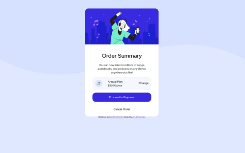
1st Project - Order Summary Card (Built with Atom)

Solution retrospective
I would appreciate feedback specifically on the following:
- How to maintain the sizes of the various elements whenever i zoom in or out.
Please log in to post a comment
Log in with GitHubCommunity feedback
- @beslerpatryk
Hey Avedi 👋
Awesome job, you are doing great. There are, however, few issues that you should work on.
Responsive units - when working on a project it is a good practice to make sure that the page you are coding looks good on both small and big screen devices. Usually, it is not recommended to define position properties such as the bottom, left, etc. using definitive values. Next time try using percents. You can read more about responsive units here: https://gist.github.com/basham/2175a16ab7c60ce8e001
I would also recommend you to check out some articles or youtube videos about the mobile-first approach. It might help you with the workflow especially at the beginning of your journey.
Hope that some of it were helpful. Keep up the good work and good luck on your future projects!
Marked as helpful - @Andrii-Rohov
Hey, try to delete these props {position: absolute; top: 50px; left: 500px;} from .landing-page and add those instead {margin-top: 100px; margin: auto; min-width: 400px; max-width: 600px;} for start. And try add to body { background-size: cover; or maybe contain;} see how it will affect it
Marked as helpful - @devjakov
this is not responsive unfortunately, the sizing keeps changing and only looks good on mid screens, above 1080p breaks and under 500p it breaks as well
The width and the height of the container need to be a fixed size
Marked as helpful


Join our Discord community
Join thousands of Frontend Mentor community members taking the challenges, sharing resources, helping each other, and chatting about all things front-end!
Join our Discord