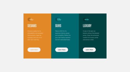
3 Card Column Layout - Mobile first, CSS Flexbox, Responsive Layout

Solution retrospective
Project done with raw HTML and CSS. My biggest questions I would love answered is how I am handling media queries and the way I construct my layout in general and from a responsive context. Any ways I can improve my code in a more efficient way? Open to all other suggestions as well!
Please log in to post a comment
Log in with GitHubCommunity feedback
- @grace-snow
Hi
It looks like you've missed a few things in this or made some mistakes
- Border radius on the component is missing
- There's no margin on the component so it can hit screen edges, which you never want to happen
- You've used multiple h1s. You can't do that. A h1 is the single main title for a webpage. This would be a component within a web page, so the cards should have h2s
- You've used button elements for what should be anchor elements
- Remember to give the document a proper title
- It's invalid to have sections within a section like this. I'm not sure why you need that extra wrapper (carCard) at all to be honest
- You never ever need to use
max-width: 100vw;
(or width). Viewport units don't account for scrollbars or device notches so you'd never have a scenario where you'd want to ignore those as with 100vw. Main is full width by default anyway - It is extremely unusual to camelCase class names like this. In more than a decade of dev work, I've never once seen a team that does that. Stick to usual code conventions, which also makes the classes easier to read - hyphenate class names (unless using a naming convention like BEM, which has specific hyphen and underscore patterns)
- Again you have more wrappers than necessary at the card level. You don't need
vehicleCard
thencardContainer
nested inside that. Always keep the html structure as simple, minimal as possible - NEVER limit the height of elements containing text like this
- Try to use rem more, eg for the max-width
- NEVER write font size in px. Extremely important because px will not honour people's font size settings. Use rem instead. Similar with line height and letter spacing - basically anything to do with fonts cannot use px, a fixed unit. Line height is usually unitless, like 1.5. Letter spacing is usually in em so it responds to the current font size
- The icons in this are decorative so must not have an alt value. That should be left intentionally blank
- The icons should have a fixed size, not in %. You always want to maintain control of icons like that. It's one of the only things you'll ever use fixed height and/or width for
- Hover styles should be on interactive elements on all screen sizes
- Your current hover effect is causing layout shift. This should never happen. To avoid it, make sure the element always has that border present.
Marked as helpful
Join our Discord community
Join thousands of Frontend Mentor community members taking the challenges, sharing resources, helping each other, and chatting about all things front-end!
Join our Discord