Skip to content
  • Unlock Pro
  • Log in with GitHub
Solution
Submitted over 3 years ago

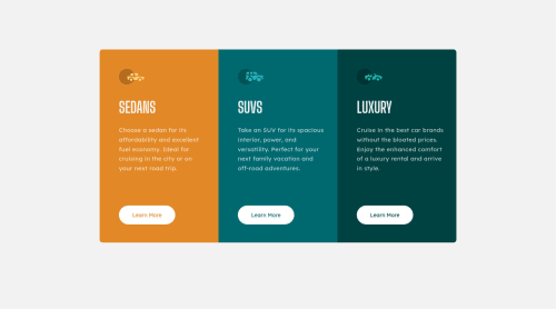
3 Card Component - Responsive

George Stawowczyk•210
@Jorgus1710
A solution to the 3-column preview card component challenge
View live sitePreview (opens in new tab)View codeCode (opens in new tab)

Solution retrospective


As I do these challenges I tend to trim the fat so to speak with regards to poor practices or bloated and unnecessary code. I disregarded the ALT tags here, but I did pay attention to another users suggestion of making text all uppercase in CSS versus inline in the HTML file. The reason being is that the screen reader will read out each letter if its all caps in HTML.

I play around a lot with flexbox on these challenges, and I continue to better understand and develop more 'instinct' as to why things work and dont work as I progress. This time around I tried to use a chrome app called pixel perfect in order to help achieve as close a look to the source material as possible. We will see how it turned out.

Question(s):

In the individual card divs (.sedans, .suvs, .luxury), I achieved the indentation from the left side of each card by simply using padding/margin-left, and adjusting that for each individual element within the card so that they all line up nicely. Moving forward, I imagine it would be a better approach to wrap all the elements inside the card within a new div, then simply adjusting the left padding/margin of that div which holds all the elements to achieve the same effect, rather than padding each element individually. Is this train of thought correct?

Any other pieces of advice or tips are of course welcome and much appreciated.

Thanks!

Code
Select a file

Please log in to post a comment

Log in with GitHub

Community feedback

  • Clara Wen•320
    @clarafuwen
    Posted over 3 years ago

    Hello! I just finished this challenge and was actually using the your proposed structure -- one div to wrap all 3 subcomponents(sedan, suvs, luxury) inside. And it worked very well.

    I noticed you have 3 class selectors for sedans, suvs and luxury. And like you proposed, since they share the same style, you could give all 3 of them one shared class (I used 'panel-item') before their current class like this

    <div class="panel-item sedans_cards">
      </div>
    

    Then if you style this shared class 'panel-item' in your CSS, all 3 subcomponents will have the same styles -- basically, style once, and use 3 times plus easier for debugging. Then all the stylings left for sedans, suvs and luxury are their unique background-color or border-radius, which could be done in their individual styling block.

    I hope this helps and let me know if you need further explanations!

    Marked as helpful

Join our Discord community

Join thousands of Frontend Mentor community members taking the challenges, sharing resources, helping each other, and chatting about all things front-end!

Join our Discord
Frontend Mentor logo

Stay up to datewith new challenges, featured solutions, selected articles, and our latest news

Frontend Mentor

  • Unlock Pro
  • Contact us
  • FAQs
  • Become a partner

Explore

  • Learning paths
  • Challenges
  • Solutions
  • Articles

Community

  • Discord
  • Guidelines

For companies

  • Hire developers
  • Train developers
© Frontend Mentor 2019 - 2025
  • Terms
  • Cookie Policy
  • Privacy Policy
  • License

Oops! 😬

You need to be logged in before you can do that.

Log in with GitHub

Oops! 😬

You need to be logged in before you can do that.

Log in with GitHub

How does the accessibility report work?

When a solution is submitted, we use axe-core to run an automated audit of your code.

This picks out common accessibility issues like not using semantic HTML and not having proper heading hierarchies, among others.

This automated audit is fairly surface level, so we encourage to you review the project and code in more detail with accessibility best practices in mind.

How does the CSS report work?

When a solution is submitted, we use stylelint to run an automated check on the CSS code.

We've added some of our own linting rules based on recommended best practices. These rules are prefixed with frontend-mentor/ which you'll see at the top of each issue in the report.

The report will audit all CSS, SCSS and Less files in your repository.

How does the HTML validation report work?

When a solution is submitted, we use html-validate to run an automated check on the HTML code.

The report picks out common HTML issues such as not using headings within section elements and incorrect nesting of elements, among others.

Note that the report can pick up “invalid” attributes, which some frameworks automatically add to the HTML. These attributes are crucial for how the frameworks function, although they’re technically not valid HTML. As such, some projects can show up with many HTML validation errors, which are benign and are a necessary part of the framework.

How does the JavaScript validation report work?

When a solution is submitted, we use eslint to run an automated check on the JavaScript code.

The report picks out common JavaScript issues such as not using semicolons and using var instead of let or const, among others.

The report will audit all JS and JSX files in your repository. We currently do not support Typescript or other frontend frameworks.

Oops! 😬

You need to be logged in before you can do that.

Log in with GitHub