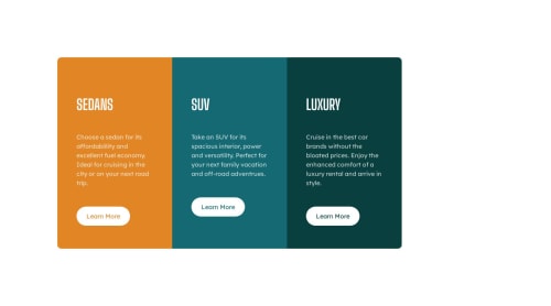
Skip to content
  • Unlock Pro
  • Log in with GitHub
Solution
Submitted about 2 years ago

3 cars columns

metallicatzach•270
@metallicatzach
A solution to the 3-column preview card component challenge
View live sitePreview (opens in new tab)View codeCode (opens in new tab)

Solution retrospective


first one. feedback needed please. thank you.

Code
Select a file

Please log in to post a comment

Log in with GitHub

Community feedback

  • _nehal💎•6,710
    @NehalSahu8055
    Posted about 2 years ago

    Hello Coder 👋.

    Congratulations on successfully completing the challenge! 🎉

    Few suggestions regarding design.

    • To properly center the container.

    • USING FLEXBOX

    body{
    min-height: 100vh;
    display: flex;
    align-items: center;
    justify-content: center;
    }
    
    • USING GRID
    body{
    min-height: 100vh;
    display: grid;
    place-items: center;
    }
    

    ➨ Use Semantics for the proper design of your code.

    <body>
    <header>
    <nav>...</nav>
    </header>
    <main>...</main>
    <footer>...</footer>
    </body>
    

    ➨ Use background:transparent; on hovering.

    button:hover{   
    background:transparent;
    }
    

    ➨ Use responsive units(rem, em, %) from next project. Explore respective use cases on google.

    link.

    I hope you find this helpful.

    Happy coding😄

  • Oluwalolope Adeleye•600
    @Oluwalolope
    Posted about 2 years ago

    Hey 👋,

    Great work with your challenge it looks really good. I have a few suggestions for you.

    • Don't leave the <alt> text-empty: It is highly recommended not to leave the alt text blank because it isn't considered best practice. If a person with visual impairments is going through your site, such person will need assistance like a screen reader. The screen reader reads out the alt text of the image. It is basically a description of your image and It is very important.

    • Use Media Queries to make your website responsive: Your site looks amazing on desktop or screens with larger displays. But it doesn't really look great on phones. That is where media queries come in🦸‍♂️🦸‍♂️🦸‍♂️. It is used as a tool to make sites responsive. Right now your site has a fixed dimensioning irrespective of the screen size but with a media query it will be more interested in the screen size. Kindly check here for further clarification Media Queries.

    Once again Congratulations 🎊 on completing your first frontend mentor challenge. I really look forward to see your next challenge submission 🔥. I hope you found this helpful😄. Goodluck👍

Join our Discord community

Join thousands of Frontend Mentor community members taking the challenges, sharing resources, helping each other, and chatting about all things front-end!

Join our Discord
Frontend Mentor logo

Stay up to datewith new challenges, featured solutions, selected articles, and our latest news

Frontend Mentor

  • Unlock Pro
  • Contact us
  • FAQs
  • Become a partner

Explore

  • Learning paths
  • Challenges
  • Solutions
  • Articles

Community

  • Discord
  • Guidelines

For companies

  • Hire developers
  • Train developers
© Frontend Mentor 2019 - 2025
  • Terms
  • Cookie Policy
  • Privacy Policy
  • License

Oops! 😬

You need to be logged in before you can do that.

Log in with GitHub

Oops! 😬

You need to be logged in before you can do that.

Log in with GitHub

How does the accessibility report work?

When a solution is submitted, we use axe-core to run an automated audit of your code.

This picks out common accessibility issues like not using semantic HTML and not having proper heading hierarchies, among others.

This automated audit is fairly surface level, so we encourage to you review the project and code in more detail with accessibility best practices in mind.

How does the CSS report work?

When a solution is submitted, we use stylelint to run an automated check on the CSS code.

We've added some of our own linting rules based on recommended best practices. These rules are prefixed with frontend-mentor/ which you'll see at the top of each issue in the report.

The report will audit all CSS, SCSS and Less files in your repository.

How does the HTML validation report work?

When a solution is submitted, we use html-validate to run an automated check on the HTML code.

The report picks out common HTML issues such as not using headings within section elements and incorrect nesting of elements, among others.

Note that the report can pick up “invalid” attributes, which some frameworks automatically add to the HTML. These attributes are crucial for how the frameworks function, although they’re technically not valid HTML. As such, some projects can show up with many HTML validation errors, which are benign and are a necessary part of the framework.

How does the JavaScript validation report work?

When a solution is submitted, we use eslint to run an automated check on the JavaScript code.

The report picks out common JavaScript issues such as not using semicolons and using var instead of let or const, among others.

The report will audit all JS and JSX files in your repository. We currently do not support Typescript or other frontend frameworks.

Oops! 😬

You need to be logged in before you can do that.

Log in with GitHub

Oops! 😬

You need to be logged in before you can do that.

Log in with GitHub