Not Found
Not Found
Not Found
Not Found
Not Found
Not Found
Not Found
Not Found
Not Found
Not Found
Not Found
Not Found
Not Found
Not Found
Not Found
Not Found
Not Found
Not Found
Not Found
Not Found

Submitted

3 column card - Mobile first approach

@Royal-tea

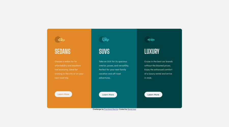
Desktop design screenshot for the 3-column preview card component coding challenge

This is a solution for...

  • HTML
  • CSS
1newbie
View challenge

Design comparison


SolutionDesign

Solution retrospective


Any feedback would be most welcome !

Community feedback

@MarlonPassos-git

Posted

some suggestions

  • each box I would put inside a <section>

  • I would put this code in an assignment so that it stays in the corner (decktop version, on mobile it would be something else)

     position: absolute;
     bottom: 15px;
     right: 20px;
  • I would reduce the size of the cards for the mobile version, they stretch a lot.

  • Instead of using padding: 15% on boxes I would recommend you to use something more FLEXIBLE 😙, I strongly recommend you to read this article, you will learn a good trick https://css-tricks.com/linearly-scale-font-size- with-css-clamp-based-on-the-viewport/#for-those-who-dont-mind-that-edge-case

1

@Royal-tea

Posted

@MarlonPassos-git Thanks I'll give it a go. I tried opening the link but it doesn't seem to work. Which part are you suggesting should stay in the corner?

0

Please log in to post a comment

Log in with GitHub
Discord logo

Join our Discord community

Join thousands of Frontend Mentor community members taking the challenges, sharing resources, helping each other, and chatting about all things front-end!

Join our Discord