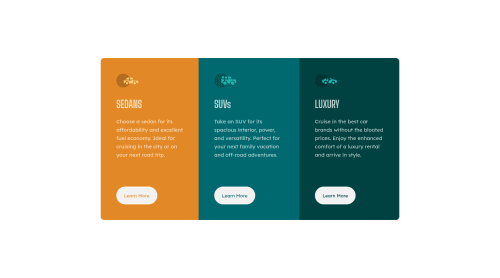
3 Column Display using HTML & CSS FlexBox

Solution retrospective
How do I make the code smaller?
One way is to make a common hover property for the buttons but then I will not be able to customize the individual colors for the buttons, so is there any other way for me to do it?
Any feedback is appreciated... Thanks.
Please log in to post a comment
Log in with GitHubCommunity feedback
- @vanzasetia
Hi there! 👋
Congratulations on finishing this challenge! 👏
I have some feedback on this solution:
- Accessibility
- Wrap all of the page content with
maintag,except the attribution. The attribution should live outside themainelement.
- Wrap all of the page content with
<body> <main> page content goes here... </main> <footer class="attribution"> attribution links goes here... </footer> </body>- I agree with @Samadeen that headings must be in a logical order. Heading tags can be used by users of assistive technology to navigate the website. If headings are not in a logical order, those users might get confused.
- In this case, make all
h2toh3. You could add a visually hiddenh1if you want. - Use CSS to uppercase the text. The uppercased word in the HTML will be spelled by the screen reader (spelled letter by letter)
- I would use link elements for the Learn more buttons. Do you have any reasons for using
buttonelements instead of link elements? - Create a custom
:focus-visiblestyling to any interactive elements (button, links,input,textarea). This will make the users can navigate this website using keyboard (by usingTabkey) easily. - Anyway, always specify the
typeof the `button to prevent the button from behaving unexpectedly (like submitting). - Good job on taking care of those icons! 👍
- Use
remor sometimesemunit instead ofpx. Usingpxwill not allow the users to control the size of the page based on their needs. - Styling
- The
bodyshould have a gray background color. Like @Beats-Ayush has said to you, usebackground-colorproperty. - Give a
max-widthto the container element to prevent the cards become too wide on mobile layout.
- The
- Best Practice (Recommended)
- Write your code with consistent style (e.g. the indentation, quotes, whitespace, etc). If you write your code with consistent style, it will make it easier to read for everyone (including your future self).
That's it! Happy coding! 😁
Marked as helpful - Accessibility
- @Samadeen
Hey Shantanu!! Cheers 🥂 on completing this challenge Here are my suggestions 1.You should use <main class="container"> instead of <div class="container">. 2. Go down orderly when you are using the headings h1 down to h2 down to h3 and so on.
. Regardless you did amazing.. Happy coding
Marked as helpful - @Beats-Ayush
ShantanuBorkar Excellent solution. Some places where you can improve your code-
-
Use the
background-colorfor the body. -
Use
background-color: transparent;in hover-state to pick up the color underlying the button. This way you can avoid applying the individual colors again. -
Use exactly one
<h1>and semantic element landmarks like<main>for better code readability and avoid accessibility errors. -
Use
max-widthto restrict the width of the body(Edit: not body but the card component which holds all the contents) to increase responsiveness.
Marked as helpful -
- @AlsoShantanuBorkar
Thank You @Beats-Ayush @vanzasetia @@Samadeen for your advice.


Join our Discord community
Join thousands of Frontend Mentor community members taking the challenges, sharing resources, helping each other, and chatting about all things front-end!
Join our Discord