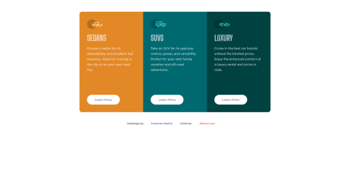
Skip to content
  • Unlock Pro
  • Log in with GitHub
Solution
Submitted over 2 years ago

3 Column flexible preview card component, using HTML and CSS

Webdevsonu•270
@Webdevsonu
A solution to the 3-column preview card component challenge
View live sitePreview (opens in new tab)View codeCode (opens in new tab)

Solution retrospective


Here another preview cards I found it easy to make for the desktop screen size, but I found a little difficulty to make it switch the border-radius for small screen size as it shrinks. And I used "flex" to arrange the cards but I found out it wasn't perfect at some point while shrinking. So will you suggest some easy methods to fix it and how to auto adjust those border-radius for small screen.

Code
Select a file

Please log in to post a comment

Log in with GitHub

Community feedback

  • PhoenixDev22•16,830
    @PhoenixDev22
    Posted over 2 years ago

    Hello Webdevsonu,

    Congratulation on finishing this challenge. Great job on this one! I have few suggestions regarding your solution:

    HTML

    • Never use <div> and <span>alone to wrap a meaningful content. Just keep in mind that you should usually use semantic HTML in place of the div tag unless none of them (the semantic tags) really match the content to group together. By adding semantic tags to your document, you provide additional information about the document, which aids in communication.
    • Page should contain <h1>. In this challenge, as it’s not recommended to have more than <h1>, you may use<h1> visually hidden with class=”sr-only”. You can find it here then you can use <h2> instead of a generic div.
    • Images must have alt attribute. In this challenge, the images are much likely to be decorative. For any decorative images, each img tag should have aria-hidden="true" attribute to make all web assistive technologies such as screen reader ignore those images .
    • You have used <br> , using <br> is not only bad practice, it is problematic for people who navigate with the aid of screen reading technology. Screen readers may announce the presence of the element. This can be a confusing and frustrating experience for the person using the screen reader. You can read more in MDN.
    • It’s not recommended to use <br> to increase the gap between lines of text Or make empty space between elements, use padding / margin styling via CSS. And about using <br> in the <p> to make the paragraph break in new line, You may use max-width to <p> and remove those <br>.
    • Adding rel="noopener" or rel="noreferrer" totarget="_blank"links. When you link to a page on another site using target=”_blank” attribute, you can expose your site to performance and security issues.
    • Add border-radius and overflow hidden to the main container that wraps the three cards so you don't have to setborder-radiusto individual corners.
    • It's not recommended to capitalize in html, let css text transform take care of that. Remember screen readers won't be able to Read capitalized text as they will often read them letter by letter thinking they are acronyms.
    • line-height:22px Use a unitless line-height value to avoid unexpected results. You can read more in mdn
    • Consider using max-width to the component that wraps the three cards instead of setting to individual cards.
    • height: 350px; It's not recommended to set fixed height to component, you almost never want to set it. let the content of the component define the height.
    • Remember a modern css reset on every project that make all browsers display elements the same.
    • Don’t Repeat Your CSS(DRY) is a good general principle to follow and eliminating duplication of css code should naturally be part of coding journey.

    Hopefully this feedback helps.

    Marked as helpful

Join our Discord community

Join thousands of Frontend Mentor community members taking the challenges, sharing resources, helping each other, and chatting about all things front-end!

Join our Discord
Frontend Mentor logo

Stay up to datewith new challenges, featured solutions, selected articles, and our latest news

Frontend Mentor

  • Unlock Pro
  • Contact us
  • FAQs
  • Become a partner

Explore

  • Learning paths
  • Challenges
  • Solutions
  • Articles

Community

  • Discord
  • Guidelines

For companies

  • Hire developers
  • Train developers
© Frontend Mentor 2019 - 2025
  • Terms
  • Cookie Policy
  • Privacy Policy
  • License

Oops! 😬

You need to be logged in before you can do that.

Log in with GitHub

Oops! 😬

You need to be logged in before you can do that.

Log in with GitHub

How does the accessibility report work?

When a solution is submitted, we use axe-core to run an automated audit of your code.

This picks out common accessibility issues like not using semantic HTML and not having proper heading hierarchies, among others.

This automated audit is fairly surface level, so we encourage to you review the project and code in more detail with accessibility best practices in mind.

How does the CSS report work?

When a solution is submitted, we use stylelint to run an automated check on the CSS code.

We've added some of our own linting rules based on recommended best practices. These rules are prefixed with frontend-mentor/ which you'll see at the top of each issue in the report.

The report will audit 1st-party linked stylesheets, and styles within <style> tags.

How does the HTML validation report work?

When a solution is submitted, we use html-validate to run an automated check on the HTML code.

The report picks out common HTML issues such as not using headings within section elements and incorrect nesting of elements, among others.

Note that the report can pick up “invalid” attributes, which some frameworks automatically add to the HTML. These attributes are crucial for how the frameworks function, although they’re technically not valid HTML. As such, some projects can show up with many HTML validation errors, which are benign and are a necessary part of the framework.

Oops! 😬

You need to be logged in before you can do that.

Log in with GitHub