Submitted over 3 years agoA solution to the 3-column preview card component challenge
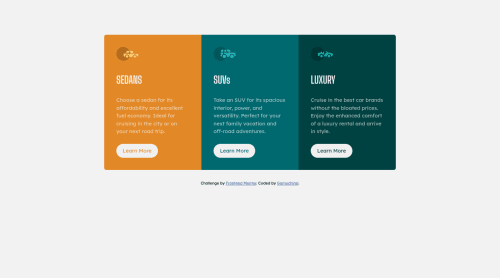
3 Column Preview Card
accessibility

@GamuchiraiS
Solution retrospective
Please leave any useful comments. Thank you so much!
Code
Please log in to post a comment
Log in with GitHubCommunity feedback
- @anoshaahmed
Hey good job! Use flex to put your component in the middle of the page in the future. :)
Marked as helpful - @Robert-Rynard
Might want to add some more margin or padding between you body and button and maybe consider putting a max width on the mobile version at larger sizes before the media query it can get quite stretched. Overall looks great nice job!
Marked as helpful - @GamuchiraiS
I have added margin around the buttons and it looks so much better, thank you so much! I will look into putting a max width on the mobile version. Your comment was helpful, thank you so much!


Join our Discord community
Join thousands of Frontend Mentor community members taking the challenges, sharing resources, helping each other, and chatting about all things front-end!
Join our Discord