Not Found
Not Found
Not Found
Not Found
Not Found
Not Found
Not Found
Not Found
Not Found
Not Found
Not Found
Not Found
Not Found
Not Found
Not Found
Not Found
Not Found
Not Found
Not Found
Not Found

Submitted

3 column preview card

#accessibility
Desktop design screenshot for the 3-column preview card component coding challenge

This is a solution for...

  • HTML
  • CSS
1newbie
View challenge

Design comparison


SolutionDesign

Solution retrospective


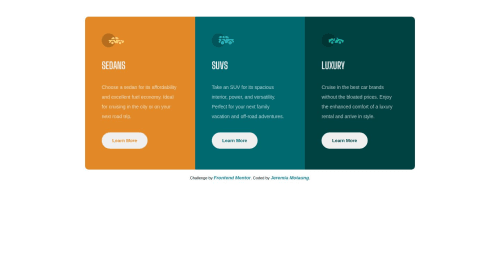
Struggled with making my buttons to stick to the bottom for equal space when responsive. Again, with buttons when you hover over they have a blackish outline instead of white one{background-color: transparent}.

Community feedback

P
Fluffy Kas 7,735

@FluffyKas

Posted

Heyo,

Buttons come with some ugly default styles you need to overwrite, one of these styles is the border. Your problem is being caused by this: border-style: outset. Instead, there is an easier way to overwrite the default look: border: 2px solid white.

I'd also say, you could adjust the breakpoint a bit, it switches way too early from the mobile to the desktop view, so the desktop view looks really squished. The min-width could easily be around 870px instead of 600.

The alt texts of the little icons can be left blank, they are decorative only (this goes for most icons).

Other than these, your solution looks pretty good! Well done.

Marked as helpful

1

Please log in to post a comment

Log in with GitHub
Discord logo

Join our Discord community

Join thousands of Frontend Mentor community members taking the challenges, sharing resources, helping each other, and chatting about all things front-end!

Join our Discord