


It looks ok, but there is some things that could be changed.
- Why did you set
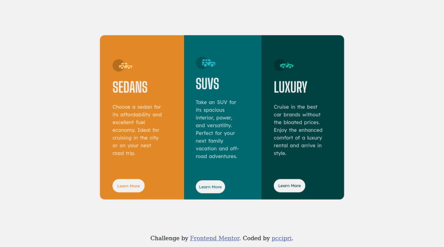
backgroundandcontaineras an id? There seems no need to do such, so it would be better to set them as class. ID's is something you need later on when doing JavaScript. - You also set class sometimes like this:
item-Luxury. There is no need to use a capital letter. Using capitals (more precisely camelCasing) is something that is again being used in JavaScript. It's ok to just writeitem-luxury. - What was the idea behind
word-spacing? It creates quite some gaps between your words. Tryletter-spacingif you intended to create a little space between the letters. Otherwise, the 2px is too big. line-heightdoesn't need to be set in px. It's usually written without either px, rem, % and just as a number. Usually line-height will be declared asline-height: 1.5https://www.w3schools.com/cssref/pr_dim_line-height.asp- If you use only 1 font-family, you only need to declare it in your body. It will win you a few lines of code.
- Declaring the same things on html and body, is kind of repeating yourself. It's suffice to just declare the things you did, on body. https://css-tricks.com/html-vs-body-in-css/
- As for responsiveness. It's better practice to use min-width as opposed to max-width. In the future, when you start tackling bigger projects, it will save you a lot of code. Also the size you set, is quite small. There is phones, tablets and big screens. At some point, your buttons become very squeezed, and the title text too big for the cards. Try to find add another width, to prevent the cards from being squeezed too much.
Happy coding!
Marked as helpful
1
Pop Andrei• 120
@pccipri
Posted
@graficdoctor Thanks a lot for taking your time to look over my solution and thanks for the advice.
0
