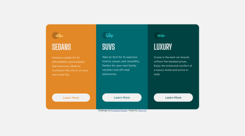
3 column preview card component

Solution retrospective
Hi Everyone, I've been practicing HTML-CSS nonstop and I think the results are finally starting to be noticeable, for this challenge I took the CSS code order/aesthetic very serious. I start using BEM and try really hard on responsive. If you want, pelase take a look and leave a feedback, it really helps me. 😅
Please log in to post a comment
Log in with GitHubCommunity feedback
- @NomiDomi
Hey @diegop985,
Really good job! It is very obvious that you've been looking into things.
Good use of the different types of units and CSS selectors.
Here are some tips on my side:
- try to keep your class names even more generic. I can see that for the different type of cards your chosen names are
card--orange,card--blue,card--green. Try usingcard-1,card-2,card-3instead. The reason for this is because in a production environment maybe you change your mind and you choose completely different colors for your card. The orange card becomes pink, the blue card becomes purple and the green card becomes blue. You can see the confusion that might create. Now think of if you work in a team and someone else comes and looks at your code. They might go straight to your CSS and change things for your card--blue, but instead of changing the current blue card they will be changing the purple one. - I see you decided to used different type of name conventions for your class name: card--orange, card__icon. Best practice wise you should use the kebab case where you put only one dash - between your words. So if I were to rewrite your classes card--orange becomes card-orange and card__icon becomes card-icon.
- it is amazing that you are using CSS variables and you take your colors from there. I would encourage you to do the same for your font family, sizes, weights etc.
Here are some useful videos:
Hope this helps! Keep coding! :)
Marked as helpful - try to keep your class names even more generic. I can see that for the different type of cards your chosen names are
- @5hraddha
Hi @diegop985, First of all, great job 👏 There are a few suggestions for improvement that I would want to give:
- Instead of using <div> as a container element every time, it would be great to use semantic tags like <header>, <main>, <section>, <article>, etc. You could look for them on MDN. The benefit of using them is that they provide a semantic meaning to the markup inherently and help screen readers for accessibility purposes too.
- When you have a list of cards to display (as in the challenge), you could make use of <ul> and put each card as a list item. Or if you want to further enhance your markup, you could use <template> that can store markup for one card and then, could use JS to clone the template and create as many copies as you want.
Marked as helpful


Join our Discord community
Join thousands of Frontend Mentor community members taking the challenges, sharing resources, helping each other, and chatting about all things front-end!
Join our Discord