3 Column Preview Card Component

Solution retrospective
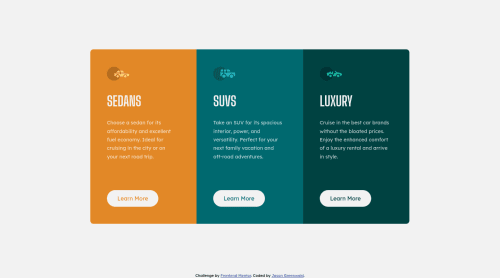
Did I implement my BEM modifiers correctly (based on BEM standards)? Did I use flex-basis correctly and was there a different/better way to solve the problem of making all three sections a uniform width? Regarding best practices, please confirm that using a link instead of a button was the correct choice for this situation. Other thoughts?
As always, thank you for the feedback and support!
Please log in to post a comment
Log in with GitHubCommunity feedback
- @Ibarra11
Overall, I think the app was good. One thing that you might want to use in the future with flex-box is giving the flex children a flex:1 instead of doing flex-basis: 33.3%. When you use flex: 1 what flex-box does is divides up the space and distributes according the ratio of the children. For example, in the application you have a card with of 920px, so if you apply flex:1 to each child and you have 3 children then flex-box divides up 920/3 and gives each child that width. When you start having a-lot of children you don't have to think of percents. Also, the link was a good choice because inferring from the challenge it seems that those buttons navigate to a different page. You want to use links when navigating to different pages.
Marked as helpful

Join our Discord community
Join thousands of Frontend Mentor community members taking the challenges, sharing resources, helping each other, and chatting about all things front-end!
Join our Discord