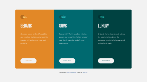
3 column preview card component challenge using HTML, CSS, CSS float

Solution retrospective
Hello everyone, this is my third challenge. I encountered more problems than I had thought but I still got them in the end. Also, I have some questions: How would you code 3 column layout such as this? By the way, is my code ok? What shoud I change to make it better?
Please log in to post a comment
Log in with GitHubCommunity feedback
- @Shreykr
I'd suggest to ditch the float and position stuffs altogether. You can do it entirely using flexbox.
The body having flex row, the card components in flex row for desktop screens, and column when it's mobile.
Instead of absolute position, you can give the content within each card as flex column. You can wrap the group the icon, heading and paragraph under an article tag (html semantic element) and button to have flex column.
So, regardless of the amount of content within each card, the button in all 3 columns occupy the same position. Then you can give margin bottom or padding to adjust.
Marked as helpful

Join our Discord community
Join thousands of Frontend Mentor community members taking the challenges, sharing resources, helping each other, and chatting about all things front-end!
Join our Discord