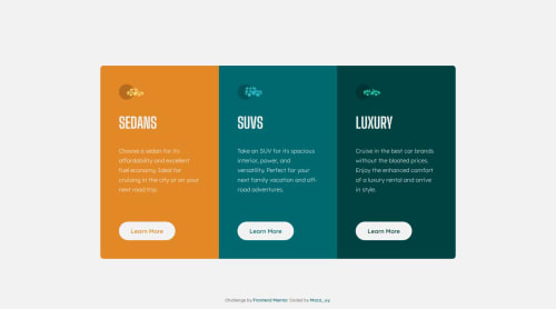
3-column preview card component – Clean CSS with BEM

Solution retrospective
I'm proud of how I organized the CSS using a clean architecture with BEM and separate files. I also made sure the layout matched the design precisely. Next time, I’d like to try building the same component using a utility-first framework like Tailwind CSS for comparison.
What challenges did you encounter, and how did you overcome them?One challenge was aligning the buttons to the bottom of each card while keeping the layout responsive. I solved it using margin-top: auto and a fixed min-height on the cards. I also learned how to fine-tune spacing across breakpoints using media queries.
What specific areas of your project would you like help with?I’d love feedback on my CSS structure and naming conventions. Also, any advice on improving accessibility and scalability for larger projects is very welcome.
Please log in to post a comment
Log in with GitHubCommunity feedback
- @thisisharsh7
Great work on completing the challenge! You've done an excellent job using BEM for class naming and splitting CSS into semantic files.
Some suggestions:
-
Consider using
<a href="#">styled as buttons instead of<button>if there's navigation intent. Also, addaria-labelswhere icons are used, even with alt text. -
Using utility classes or a utility-first framework like Tailwind (as you mentioned) can help scale larger projects and avoid repetition.
-
Great use of CSS custom properties. You could extend this by creating theme tokens (e.g.,
--card-bg-orange, etc.) to simplify future theming. -
The use of media queries is solid. Consider using
clamp()for font sizes to add fluidity between breakpoints.
Overall, clean solution - happy coding!
Marked as helpful -
- @Esabdul
There’s a bit of excessive vertical spacing at the bottom of your layout, mainly caused by the .attribution class using transform: translateY(50px);.
While this may have been used to push the text away from the cards visually, it ends up feeling disconnected from the rest of the content.
Relying on natural layout spacing using margins or padding would be a more predictable and semantic approach.
Additionally, the fixed width and height of your buttons (146px by 48px) might become limiting in certain contexts.
A more flexible approach using padding and perhaps a min-width would allow the buttons to adjust gracefully to different text lengths or screen sizes.
Also, the combination of gap: 36px and padding: var(--spacing-lg) can result in a slightly “over-padded” feel, especially on smaller screens.
Slightly tightening these values could improve the overall look.


Join our Discord community
Join thousands of Frontend Mentor community members taking the challenges, sharing resources, helping each other, and chatting about all things front-end!
Join our Discord