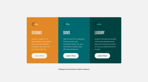
3 column preview card component / flex

Solution retrospective
I build it with flex, so it's full responsive. I had small problems with it, but finaly I did it! Small thing, but I'm happy ;)
Please log in to post a comment
Log in with GitHubCommunity feedback
- P@Milleus
👋 Hello!
Congratulations on completing the challenge. 🥳
There are a few things that I think would make this even better:
- Use only one <h1> per page, for accessibility and SEO. In this case I'd see "Sedans", "SUVs" and "Luxury" of the same logical level, so I'd approach this by adding a <h1> with a screen reader only class (visually hidden but still picked up by screen readers), and have "Sedans", "SUVs" and "Luxury" as <h2>. Here's a good video by Kevin Powell sharing more about headings.
- In the footer, to be more semantically correct, use <p> instead of <div> for texts.
- For the rounded borders, an alternative approach is to set
border-radius: 8px
andoverflow: hidden
on the parent. This could make things a little easier as the border-radius would not need to be updated in the media query. - For the anchor elements CSS, because the font-size isn't explicitly set and there's a fixed pixel height and width set, there will be text overflowing out of the element when the base font-size increases (i.e. someone who increased font size on their device). Most cases of fixed widths or heights could be replaced with
min-width
ormax-width
etc, so that it scales better. Another approach would be to usepadding
instead. I'd also recommend usingem
orrem
units instead ofpx
for better accessibility.
Nice work and keep up the good job! I hope this helps and happy coding! 😊
Marked as helpful
Join our Discord community
Join thousands of Frontend Mentor community members taking the challenges, sharing resources, helping each other, and chatting about all things front-end!
Join our Discord