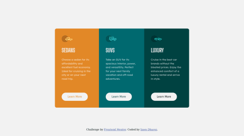
3 Column Preview Card Component Main

Solution retrospective
Please Provide Feedback
Please log in to post a comment
Log in with GitHubCommunity feedback
- @PhoenixDev22
Hello @imendh02 , I have some suggestions:
To get rid of the accessibility issues :
-
Document should have one main landmark. Wrap the body content in
< main>tag read more about main landmark. -
You don't need div's ,
<main >can wrap all the component (the three cards) . -
Use a
<footer>for theclass="attribution". -
You can add a
<h1>withclass="sr-only"(Hidden visually, but present for assistive tech).
.sr-only {
	border: 0 !important;
	clip: rect(1px, 1px, 1px, 1px) !important; /* 1 */
	-webkit-clip-path: inset(50%) !important;
		clip-path: inset(50%) !important;  /* 2 */
	height: 1px !important;
	margin: -1px !important;
	overflow: hidden !important;
	padding: 0 !important;
	position: absolute !important;
	width: 1px !important;
	white-space: nowrap !important;            /* 3 */
}
To read more This fairly modern technique will hide or clip content that does not fit into a 1-pixel visible area. Like off-screen content, it will be visually hidden but still readable by modern screen readers.
-
You can replace the
<h1 >by<h2>. -
Images must have
alttext. In this challenge all the images are decorative, eachimgtag should have emptyalt=""andaria-hidden="true"attributes to make all web assistive technologies such as screen reader ignore those images. -
Swap the buttons for anchor tags. Clicking those
"learn more"buttons would trigger navigation not do an action so button elements would not be right. -
If you are using a button element, always tell the browser the type of the button to prevent the browser from submitting any information. In this case, it should be a
type="button". -
A hover effect that raises a button looks strange. It's not a natural movement to happen.
CSS:
-
<main>shouldn't haveposition: absolute;, It's a flex container. -
You should use
emandremunits .Bothemandremare flexible, scalable units which are translated by the browser into pixel values, depending on the font size settings in your design. Usingpxwon't allow the user to control the font size based on their needs. -
For each card :
{ display:flex; flex-direction: column; align-items: flex-start; }-
Set everything inside the cards to have some margin in one direction. Only the button wouldn't need it ,
margin-top: auto;for the<a>Because this is a flex column,margin-top: autowill push it to the bottom of the cards. -
border-radiusandoverflow hiddento the container<main>that wraps all the cards so you don't have to set it to individual corners. -
375pxis very late to start the mobile layout. Start it as soon as there is room for the layout.
Hopefully this feedback helps.
Marked as helpful -

Join our Discord community
Join thousands of Frontend Mentor community members taking the challenges, sharing resources, helping each other, and chatting about all things front-end!
Join our Discord