Skip to content
  • Unlock Pro
  • Log in with GitHub
Solution
Submitted almost 3 years ago

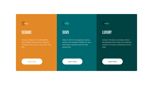
3 Column Preview Card Component Solution

sass/scss, styled-components
POTB•330
@Peteonthebeat
A solution to the 3-column preview card component challenge
View live sitePreview (opens in new tab)View codeCode (opens in new tab)

Solution retrospective


My solution for the 3 Column Preview Card Component challenge.

I am unsure of the slight expansion the button border causes on larger screens, I'd be happy to learn about a practice that avoids that.

Regards!

Code
Select a file

Please log in to post a comment

Log in with GitHub

Community feedback

  • PhoenixDev22•16,830
    @PhoenixDev22
    Posted almost 3 years ago

    Hi POTB,

    You're welcome and glad to help.

    /* In the markdown, you can type */
    - First item
    - Second item
    - Third item
    

    You can read more in here

    Happy coding!

    Marked as helpful
  • PhoenixDev22•16,830
    @PhoenixDev22
    Posted almost 3 years ago

    Hi POTB,

    First of all, awesome work again.

    I see you have finished another challenge. I have some suggestions, if you don't mind:

    • Page should contain a level-one heading. In this challenge , as it’s not a whole page, you can have<h1>visually hidden with sr-only.
    • What would happen when the user click those learn more? In my opinion, clicking those "learn more" would likely trigger navigation not do an action so button elements would not be right. So you should use the <a>. For future use , it's a good habit of specifying the type of the button to avoid any unpredictable bugs.
    • In this challenge, the images are much likely to be decorative. For any decorative images, each img tag should have empty alt="" and aria-hidden="true" attributes to make all web assistive technologies such as screen reader ignore those images. For future use , the alternate text should not be hyphenated , it should be human readable.

    Hopefully this feedback helps

    Marked as helpful
  • POTB•330
    @Peteonthebeat
    Posted almost 3 years ago

    Hey @correlucas, Thanks for commenting and taking the time to check this solution. I agree with what you say, but I thought that would make the container look odd at 700-800px width. I added the media queries to prevent that, but I'll definitely consider what you say to get things done with fewer lines of code.

    Regards!

  • Lucas 👾•104,160
    @correlucas
    Posted almost 3 years ago

    👾Hello Peter, congratulations for your new solution!

    I saw your solution and is just perfect. I have only one advice regarding the number of media queries you've add. In this challenge you need only one a media query to change the design mobile. You can let the container desktop contract since its flex until 700px and then change the flow without active 2 or 3 medias.

    For the mobile version since the media query gets active you can set max-width: 100% to let the container grow the maximum minus the margin/padding.

    👋 I hope this helps you and happy coding!

Join our Discord community

Join thousands of Frontend Mentor community members taking the challenges, sharing resources, helping each other, and chatting about all things front-end!

Join our Discord
Frontend Mentor logo

Stay up to datewith new challenges, featured solutions, selected articles, and our latest news

Frontend Mentor

  • Unlock Pro
  • Contact us
  • FAQs
  • Become a partner

Explore

  • Learning paths
  • Challenges
  • Solutions
  • Articles

Community

  • Discord
  • Guidelines

For companies

  • Hire developers
  • Train developers
© Frontend Mentor 2019 - 2025
  • Terms
  • Cookie Policy
  • Privacy Policy
  • License

Oops! 😬

You need to be logged in before you can do that.

Log in with GitHub

Oops! 😬

You need to be logged in before you can do that.

Log in with GitHub

How does the accessibility report work?

When a solution is submitted, we use axe-core to run an automated audit of your code.

This picks out common accessibility issues like not using semantic HTML and not having proper heading hierarchies, among others.

This automated audit is fairly surface level, so we encourage to you review the project and code in more detail with accessibility best practices in mind.

How does the CSS report work?

When a solution is submitted, we use stylelint to run an automated check on the CSS code.

We've added some of our own linting rules based on recommended best practices. These rules are prefixed with frontend-mentor/ which you'll see at the top of each issue in the report.

The report will audit all CSS, SCSS and Less files in your repository.

How does the HTML validation report work?

When a solution is submitted, we use html-validate to run an automated check on the HTML code.

The report picks out common HTML issues such as not using headings within section elements and incorrect nesting of elements, among others.

Note that the report can pick up “invalid” attributes, which some frameworks automatically add to the HTML. These attributes are crucial for how the frameworks function, although they’re technically not valid HTML. As such, some projects can show up with many HTML validation errors, which are benign and are a necessary part of the framework.

How does the JavaScript validation report work?

When a solution is submitted, we use eslint to run an automated check on the JavaScript code.

The report picks out common JavaScript issues such as not using semicolons and using var instead of let or const, among others.

The report will audit all JS and JSX files in your repository. We currently do not support Typescript or other frontend frameworks.

Oops! 😬

You need to be logged in before you can do that.

Log in with GitHub

Oops! 😬

You need to be logged in before you can do that.

Log in with GitHub

Oops! 😬

You need to be logged in before you can do that.

Log in with GitHub

Oops! 😬

You need to be logged in before you can do that.

Log in with GitHub