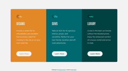
3 Column Preview Card Component using CSS Flexbox and Grid

Solution retrospective
Hey everyone👋
What do you think of my code?
How can I improve my coding skills?
If you have any suggestions, feedback is appreciated!
Please log in to post a comment
Log in with GitHubCommunity feedback
- @mattari97
Hello Aatif Sohel. Good job on completed this challenge 🎉🎉
It looks good at 375px and above 1280px. However as stated by @Yehan20 you should avoid using fixed sizes.
The goal is to make the component take the maximum space available but give it the ability to shrink to fit in the screen.
You have two ways to implement a
max-width:.my-component { max-width: 32rem; /* 1rem = 16px */ width: 100%; }.my-component { width: min(100%, 32rem); }Secondly I think you should have a transition on your buttons on hover and add the :focus selector to make sure the styles also change when the user focus the button with keyboard navigation.
An implementation could be:
.my-button {
    color: white;
    background-color: black;
    transition: color 300ms linear, background-color 300ms linear;
}

.my-button:hover,
.my-button:focus {
    color: black;
    background-color: white;
}
Hope it helps. Happy coding. Peace 😊
Marked as helpful - @Yehan20
Hello Congratulation's on the challenge .Instead of using a fixed width you could use a max width for each cards , which means it will act responsively. also , in order to make it responsive from the mobile device break point , you could change the size of the dimension of your media query for example in your style.
@media (max-width: 375px) {}
    you could change it to
@media (max-width: 767px) {} so your layout would look more cleaner
I hope my feedback was helpful.
Marked as helpful


Join our Discord community
Join thousands of Frontend Mentor community members taking the challenges, sharing resources, helping each other, and chatting about all things front-end!
Join our Discord