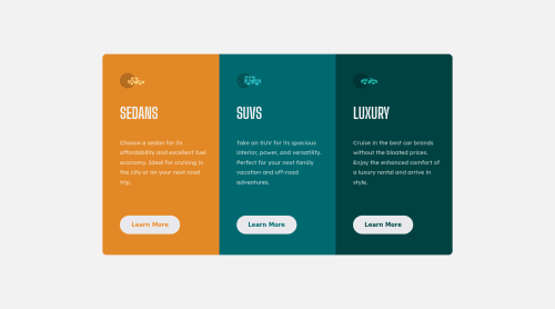
3 column Preview Card Component using HTML and CSS

Solution retrospective
Finally was brave enough to use a media query lol. Was wondering if anyone could check out the responsiveness and let me know if thats ok? Hopefully yes and ill be able to go back to my previous challenges and update them all with responsiveness. Thank you all!
Please log in to post a comment
Log in with GitHubCommunity feedback
- @12Kentos
Hey @briansegura15 Nice job on the media query! I checked over your code an notice something I thought I would point out. You have the following code.
/* Box sizing rules */ *, *::before, *::after { box-sizing: border-box; }/* Remove default margin */ body, h1, h2, h3, h4, p, figure, blockquote, dl, dd { margin: 0; }Is there a specific reason you reset the margin the way you did?
A similar way of doing it would simply be to include the
margin: 0;inside of the * code block you have. Here's an example of what I'm talking about.*, *::before, *::after { box-sizing: border-box; margin: 0; }You could also include the padding in there as well, to do a complete and total reset.
As for the media query, like I said congrats! I do have one suggestion though, I noticed once the query takes affect, it makes the entire component fit into the view screen, making everything small and hard to read. I would suggest allowing it to flow past the view screen, (vertically downwards that is) allowing everything to become a larger size. It's okay on a mobile phone for people to have to scroll to see the entire component, that's a natural thing on phones. Besides that everything is looking good!
Hope that helps!
Marked as helpful

Join our Discord community
Join thousands of Frontend Mentor community members taking the challenges, sharing resources, helping each other, and chatting about all things front-end!
Join our Discord