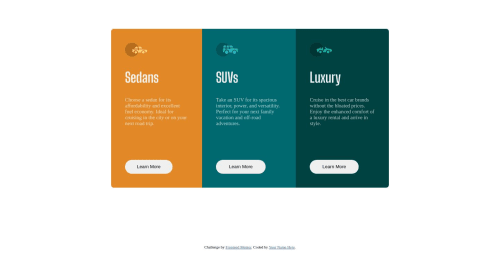
3 column preview card component using HTML and CSS

Solution retrospective
Hi all, for the first time I tried to use @media. One problem I encountered was how to remove the border radius (at the bottom of sedan and top of luxury) when it switches from full screen to mobile view. Additionally any other feedback regarding the responsive element would be helpful, as im just starting to learn this.
Additionally I set the colors as variables, thanks to some very helpful feedback. It was going well until I tried to use it on the background of the flex items(.sedan, .suv and . luxury). When I applied the var all the colors disappeared. im not quite sure what i did wrong, so any feedback would be great.
Please log in to post a comment
Log in with GitHubCommunity feedback
No feedback yet. Be the first to give feedback on chrisdh80's solution.
Join our Discord community
Join thousands of Frontend Mentor community members taking the challenges, sharing resources, helping each other, and chatting about all things front-end!
Join our Discord