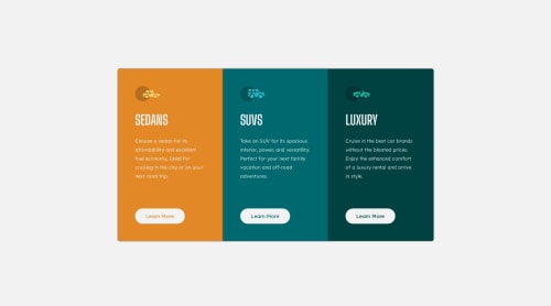
3 Column Preview Card

Solution retrospective
So I'm pretty new to coding and this is the first time working with media queries. It took awhile to get the correct order of the code and I'm still not exactly sure how it works yet. The way its coded in the css file is the only way I could target the .column div to change the css for the screen size change. I'm not sure if there's a easier way to do it, I haven't really messed with it a lot outside of this project. I didn't know if there was a way to just do 1 media query for all the css changes. Any tips on how to code the media query would be great. I'm hopeful I'll figure it out as I practice it for different projects.
I wanted to start out small for my first project to upload here to see if I could actually do it and I think it turned out well. I'm totally open to any feedback as being new I'm still learning a lot everyday.
Thanks for lookin!
Please log in to post a comment
Log in with GitHubCommunity feedback
No feedback yet. Be the first to give feedback on Sean Mathew's solution.
Join our Discord community
Join thousands of Frontend Mentor community members taking the challenges, sharing resources, helping each other, and chatting about all things front-end!
Join our Discord